Fluorescent
Eclipse
Eclipse
  • Get started
    • Migrating to Eclipse
    • Theme license
  • FAQs
  • Changelog
    • Update your theme
  • General
    • Editing themes
      • Dynamic content with metafields
      • Edit default theme content
      • Multiple languages
      • Unique content for markets
      • Customizing your site
      • H1 heading tags
    • Image guide
      • Web ready photography
      • Image sizes
      • File formats
      • Theme image settings
    • SEO for Shopify
    • Online store speed
    • Accessibility
  • Theme settings
    • Theme settings
      • Social media
    • Theme styles
    • Fonts
    • Colors
  • Corner rounding
  • Pages
    • Page templates
      • Using templates
      • Customize page styles
      • Create and assign templates
    • Demo layouts
    • About page
    • Home page
    • Blog page
    • Blog post
    • Contact page
    • Password page
    • Search page
  • Sections
    • Sections
      • Using sections
      • Content blocks
    • Blog posts
    • Collapsible content
    • Collection list
    • Contact form
    • Featured collection
    • Featured links
    • Feature product
    • Grid
    • Icon with text columns
    • Image hero
    • Image with text
    • Multi-column
    • Newsletter
    • Rich text
    • Scrolling content
    • Shop the look
    • Shoppable feed
    • Slideshow
    • Video
    • Video hero
    • Video with text
    • Custom Liquid
  • Header
    • Announcement bar
    • Header
      • Layout and style
      • Logo
      • Transparent header
      • Mega menu
      • Language and Currency
    • Impact logo
    • Search
  • Footer
    • Footer
      • Image Text and Socials
      • Links block
      • Newsletter and Socials
      • Language and Currency
      • Custom Liquid
  • Products
    • Product listings
      • Product card styles
      • Sale and sold out badges
      • Quick shopping
    • Prices and currencies
    • Swatches
      • Use default colors
      • Use custom colors
      • Use custom images
  • Product pages
    • Product page
      • Gift card product
    • Media gallery
      • Media grouping
    • Product overview blocks
      • Description
      • Price
      • Buy buttons
      • Collapsible row
      • Complementary products
      • Custom option
      • Featured icon with text
      • Icon with text
      • Inventory status
      • Image block
      • Popup block
      • Product rating
      • Text block
      • Share icons
      • Custom Liquid
    • Variant selector
      • Info popup
    • Sticky add-to-cart
    • Sibling products
    • Product recommendations
  • Collections
    • Collection page
      • Banner
      • Product grid
      • Promotion tiles
      • Filters and sorting
    • Collection list page
  • Cart
    • Cart
    • Free shipping bar
    • Cross sells
  • Popups
    • Popups
  • Support
    • Support policy
    • Shopify vs Theme issues
    • Store access requests
  • Advanced
    • Custom CSS
    • Custom fonts
Powered by GitBook
On this page
  • Set up section
  • Select feature collection
  • Change layout
  • Add promotion tile
  • Add image or autoplay video
  • Add image overlay
  • Add text
  • Add link and button

Was this helpful?

  1. Sections

Featured collection

Last updated 1 month ago

Was this helpful?

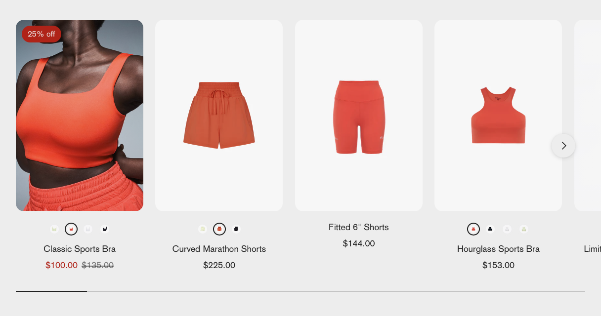
Use the Featured collection section to display products from a selected collection as a single-row slider.

Add a with featured image or autoplay video (without sound).

Editing templates will change all pages that use the same template. for different page layouts, or in the same template.

Set up section


In the editor side panel, click (+) Add section and select Featured collection. Click and hold the drag handles ⋮⋮ to re-order sections.

Click the section to add a section header and change section styles for colors and spacing.

Select feature collection


Select a Collection from your Shopify admin to display its products.

Click Featured collection section to find settings

Setting
Description

Collection

Select a collection to display its products. Collections are created and edited in your Shopify admin.

Change layout


Adjust the layout by changing the number of columns for desktop and mobile.

Click Featured collection section to find settings

Setting
Description
Options

Maximum number of products

Set the maximum number of products that should be displayed from the collection.

1-12 Default: 8

Number of columns on desktop

Select the number of products per row on desktop screens.

2 3 Default 4

Number of columns on mobile

Select the number of products per row on mobile screens.

1 2 Default

Show slider scrollbar

When checked, the scrollbar appears below the products and allows visitors to move through the slider.

Add promotion tile


Add a promotion tile with an image or autoplay video, promotional text, and link to other pages.

Add image or autoplay video


Add an image or autoplay video (without sound) as the promotion tile's background.

For autoplay videos, make sure your video files meet the following requirements:

Video file type

.mp4 or .mov Embedded YouTube or Vimeo videos are not supported.

Video length

< 20 seconds (Recommended)

Video size

< 10MB (Recommended)

Click Promotion tile block to find settings

Setting
Description

Image

Select or upload an image for the promotion tile.

Mobile image

Select or upload an alternate image for mobile devices.

Video

Add a short autoplay video (without sound) to replace the image.

Add image overlay


The image overlay adds a layer of color to your image. Overlays help balance image and text for clarity and readability.

  • Choose a Color scheme for the overlay and overlay text

  • Change the Opacity to make the overlay more or less transparent

Use overlay for solid color slide

You can set the Overlay opacity to 100% to show solid color tile.

Click Promotion tile block to find settings

Setting
Description
Options

Overlay opacity

Adjust the transparency of the color overlay on the promotion tile.

0 - 100 % Default: 20

Add text


Click Promotion tile block to find settings

Setting
Description
Options

Heading

Add a title for the promotion tile.

Default: Promotion

Text

Add descriptive text for the promotion.

Text alignment

Set the position of the text content within the promotion tile.

Top / Middle / Bottom Left / Center / Right

Add link and button


You can make the promotion tile a clickable link or add a button to redirect visitors to another page.

Setting
Description
Options

Link URL

Enter the URL that you want the promotion tile to link to.

Button label

Enter the text to display on the button.

Default: Shop now

Button style

Choose the visual style of the button.

Solid Default Outline Text

Button placement

Select where to position the button within the promotion tile.

Standard Bottom-anchored Default

Section header

Section colors

Width and Padding

Create new templates
show dynamic page content
Promotion tile