> For the complete documentation index, see [llms.txt](https://help.fluorescent.co/llms.txt). Markdown versions of documentation pages are available by appending `.md` to page URLs; this page is available as [Markdown](https://help.fluorescent.co/eclipse/theme-settings/corner-rounding.md).

# Corner rounding

{% hint style="info" %}
This feature is available in v3.0 and later. Learn how to [update your theme](/eclipse/changelog/update-your-theme.md) to access new features.
{% endhint %}

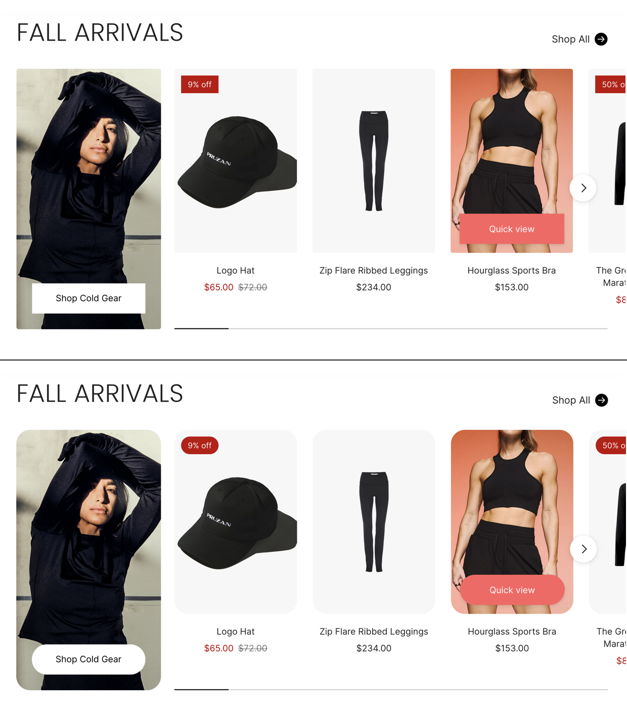
Use the **Corner radius** settings to change the roundness of elements across your site — including images, inputs, buttons, drawers, and popups.

Corner radius settings apply to elements across your theme. Some sections and blocks have an option to [toggle on or off the image corner radius](#toggle-image-corner-radius).

<div><figure><img src="/files/AZoEmr8YE6FFcZqk0VFh" alt="" width="188"><figcaption></figcaption></figure> <figure><img src="/files/FnnQEjUGUgbYpVlAceMo" alt="" width="563"><figcaption><p>Square versus rounded corners</p></figcaption></figure></div>

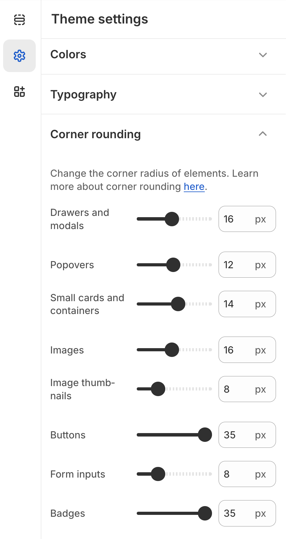
In your theme editor, go to **Theme settings > Corner rounding**

<table><thead><tr><th width="145">Setting</th><th>Description</th></tr></thead><tbody><tr><td><strong>Drawers and modals</strong></td><td>All drawers and modals, including: <br><br><a href="/pages/mrv0HwGOcDfWfjEzGlJ6">Quick cart</a> | <a href="/pages/my27xj6ezRVDTgkmeoiq">Search drawer</a> | <a href="/pages/NDNmiM6RXB5UBg2SGGk1">Mega menus</a> | <a href="/pages/tmqhtEeqe0kEwBajWsS1">Popups</a> | <a href="/pages/8QM9MhSVD7IyUm1qmdWk">Quick shop</a> | <a href="/pages/4uBlRVxwxgMywTAHMM51">Info popup</a></td></tr><tr><td><strong>Popovers</strong></td><td>All dropdown menus and submenus, as well as the <a href="/pages/zEU9QfrufUDUQ66Uik9x">Sticky add-to-cart</a>.</td></tr><tr><td><strong>Small cards and containers</strong></td><td>All small cards and containers, including: <br><br><a href="/pages/mrv0HwGOcDfWfjEzGlJ6">Cart items</a> | <a href="/pages/wKfSEZOr3mnW5sKVCczG">Complementary items</a> | <a href="/pages/NT42s0vcW8ou1qa1abGZ">Free shipping bar</a> | <a href="/pages/Ug0RI0DCr5i244UFarCz">Featured icon with text</a></td></tr><tr><td><strong>Images</strong></td><td>All images, including <a href="/pages/jT9R0Hn146I7dPLOgcJK">product listings</a>.</td></tr><tr><td><strong>Image thumbnails</strong></td><td>All small image thumbnails, including: <br><br><a href="/pages/xHSCxA4JXppUU1PTbj98">Product media gallery</a> | <a href="/pages/mrv0HwGOcDfWfjEzGlJ6">Cart items</a> | <a href="/pages/zEU9QfrufUDUQ66Uik9x">Sticky add-to-cart</a></td></tr><tr><td><strong>Buttons</strong></td><td>All buttons, including <a href="/pages/5TuK6lgxJb5c1H2WD2FA#variant-selector-style">variant chips</a> and <a href="/pages/0vzTP0Stl3Zu9uSeRacx">filter button</a>.<br><br><strong>Does not include</strong>: <a href="/pages/XeP1NCniPgMwEdnnBXop#swatch-options">Swatches</a>, Cart icon, Quick view button, Image zoom icon, quantity buttons, or slider cursors.</td></tr><tr><td><strong>Form inputs</strong></td><td>All dropdown menu buttons, text fields, and checkboxes. For example:<br><br><a href="/pages/my27xj6ezRVDTgkmeoiq">Search bar</a> | <a href="/pages/mV9uWQ3XDoM8Qh00YAUc">Newsletter signup</a> | <a href="/pages/5TuK6lgxJb5c1H2WD2FA">variant dropdowns</a>.</td></tr><tr><td><strong>Badges</strong></td><td>All <a href="/pages/lHkYr8Pi1m4nEvlL00o4">sale and sold-out badges</a> in product listings and product pages.</td></tr></tbody></table>

### Toggle image corner radius

***

In some sections and blocks, you have the option to use rounded corners or not. The **Enable image corner radius** option is enabled by default.&#x20;

Click the section or block to find the settings:

* [Image content block](/eclipse/sections/overview/content-blocks.md#image-block)
* [Product overview image block](/eclipse/product-pages/product-content-blocks.md#content-blocks)
* [Blog post template - Content block](/eclipse/pages/blog-post-page.md#customize-page-style)
* Page section
