
> For the complete documentation index, see [llms.txt](https://help.fluorescent.co/llms.txt). Markdown versions of documentation pages are available by appending `.md` to page URLs; this page is available as [Markdown](https://help.fluorescent.co/section-studio/sections/section-styles.md).

# Section styles

**Sections** are the basic components of templates. You can add, rearrange, and customize sections to create the layout and content of your pages.

## Content area

### Corner radius

Use the **Corner radius** settings to change the roundness of elements across your site — including images, inputs, buttons, drawers, and popups.

Corner radius settings apply to elements across your theme. Some sections and blocks have an option to [toggle on or off the image corner radius](#toggle-image-corner-radius).

## Section styles

***

All sections include general style options for **Colors** and **Spacing**. In the editor side panel, click the section to find settings for **Color scheme**, **Section width**, and **Section padding**.

### Color schemes

***

{% columns %}
{% column width="66.66666666666666%" %}
You can change the section or block colors by assigning a color scheme using the color scheme picker.

Click the section or block to find the **Color scheme** option.
{% endcolumn %}

{% column width="33.33333333333334%" %}

{% endcolumn %}
{% endcolumns %}

{% hint style="info" %}
A **color scheme** consists of a set of colors that you can use for sections throughout your store. Color schemes help you create consistent palettes.
{% endhint %}

#### Color scheme options

### Overlay colors

***

When text appears over images or videos, an overlay color is used to provide contrast between the text and background, keeping it readable and accessible for everyone.

{% stepper %}
{% step %}
In the section or block settings, select a **color scheme.**

{% hint style="info" %}
The overlay uses the color scheme's **background** color. If the color scheme has a **background gradient**, it will be used instead.\
\
Background gradients fade across a range of hues. Learn more in Shopify's [color gradient guide](https://help.shopify.com/en/manual/online-store/themes/theme-structure/color-scheme#gradients).
{% endhint %}
{% endstep %}

{% step %}
Use the **overlay opacity** slider to make the tint more or less transparent.

{% hint style="info" %}
Set the opacity to 0% to turn off the tint overlay.

Set the opacity to 100% to create **solid color blocks or banners** in sections
{% endhint %}
{% endstep %}
{% endstepper %}

`Click the section or block to find settings`

<table><thead><tr><th width="164">Setting</th><th width="400">Description</th><th>Options</th></tr></thead><tbody><tr><td><mark style="color:blue;">Overlay opacity</mark></td><td>Use the slider to change the transparency of the overlay.<br><br>Set the opacity to 0% to turn off the overlay.</td><td><strong>0 - 100</strong> %</td></tr></tbody></table>

### Section width

***

Change the **Section width** to adjust how far the section spans across the page. In the section settings, find **Width** options under *Section.*

* The **page width** has a fixed width of 1600px
* Other width options adapt to the visitor's browser width

<table data-view="cards"><thead><tr><th align="center"></th><th></th><th data-hidden data-card-cover data-type="image">Cover image</th></tr></thead><tbody><tr><td align="center"><strong>Page width</strong></td><td>Section background and content span the page width.</td><td data-object-fit="contain"><a href="https://1258209387-files.gitbook.io/~/files/v0/b/gitbook-x-prod.appspot.com/o/spaces%2FwW8WoofsfSzp49h7DuLl%2Fuploads%2FKskyrvuQ2oTj7tsqqggV%2Fpage-width.png?alt=media&amp;token=2bf5b977-36e7-497d-964b-639016795812">page-width.png</a></td></tr><tr><td align="center"><strong>Full width (padded)</strong></td><td>Section spans the screen's full width with some padding.</td><td data-object-fit="contain"><a href="https://1258209387-files.gitbook.io/~/files/v0/b/gitbook-x-prod.appspot.com/o/spaces%2FwW8WoofsfSzp49h7DuLl%2Fuploads%2FH0YFSR5SvPbacTJwRfix%2Ffull-width-padded.png?alt=media&amp;token=7abbf792-228d-4808-808d-afb6d569aec6">full-width-padded.png</a></td></tr><tr><td align="center"><strong>Full width</strong></td><td>Both section background and content span the screen's full width.</td><td data-object-fit="contain"><a href="https://1258209387-files.gitbook.io/~/files/v0/b/gitbook-x-prod.appspot.com/o/spaces%2FwW8WoofsfSzp49h7DuLl%2Fuploads%2FkJ6rUO7TGNJRIE1AcexA%2Ffull-width.png?alt=media&amp;token=bcf5796e-3931-4689-ac34-795584378cbe">full-width.png</a></td></tr></tbody></table>

### Section padding

***

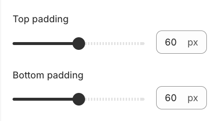
Use the sliders to add space at the top and bottom of the section. Set to 0 to remove spacing.

<div><figure><img src="https://1258209387-files.gitbook.io/~/files/v0/b/gitbook-x-prod.appspot.com/o/spaces%2FwW8WoofsfSzp49h7DuLl%2Fuploads%2F23lEbj12B7JjIYHHRADj%2Fsection-padding-setting.png?alt=media&amp;token=6365d5c7-3c9d-4c40-93e0-f16b8cc6d4b9" alt="" width="338"><figcaption></figcaption></figure> <figure><img src="https://1258209387-files.gitbook.io/~/files/v0/b/gitbook-x-prod.appspot.com/o/spaces%2FwW8WoofsfSzp49h7DuLl%2Fuploads%2FU1IrPgwZ9dlrnr9cNzSm%2Fsection-padding.png?alt=media&amp;token=42dec7c8-59b2-4b2c-9741-75dfe0b4c7b4" alt="" width="375"><figcaption></figcaption></figure></div>
