

| Header | Add text for header of row group. |
| Content columns | Display text content 1 or 2 columns. |
| Header | Add text for the row title. |
| Text | Add text that's revealed when the row is opened. |
| Placement | Left / Right |
| Font | Body Heading |
| Text size | 1 - 4 |
| Sticky tabs | |
| Active tab indicator | Dot beside Line below |
| Dim inactive tabs | |
| Advanced sticky settings | Reveal settings to adjust the alignment of the sticky and scroll position. |
| Vertical offset | Applies to both the sticky tabs and the scroll positioning. Advanced scroll positioning is best tested outside the theme editor. |
| Custom CSS variable | Apply complex offset values by providing a valid CSS variable (eg. --my-custom-variable). |
| Header font | Body Heading |
| Header size | 1 - 6 |
| Vertical spacing | 1 - 20 |
| Width | 30 - 70% |
| Header size | 1 - 6 |
| Text size | 1 - 4 |
| Row padding | 1 - 8 |
| Row style | Filled Dividers |
| Space between rows | 1 - 8 |
| Color scheme | Match section Default Inverse Soft Accent Accent inverse Overlay Color scheme 1 Color scheme 2 |
| Border | |
| Corner radius | |
| Dropshadow |
| Placement | Left / Right |
| Font | Plus open, x close Plus open, minus close Caret |
| Use custom icons | |
| Icon size | Dot beside Line below |
| Icon frame | None Circle Square |
| Color scheme | Applies to default icons only. |
| Cover image | ||
|---|---|---|
| Full width | Section background and content span the screen's full width. | full-width.png |
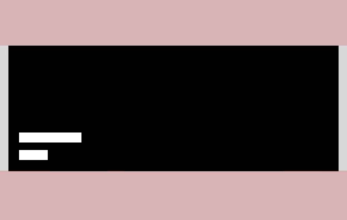
| Full width padded | Section spans the screen's full width with some padding. | full-width-padded.png |
| Page width | Section background and content span the page width. | page-width.png |
| Setting | Options |
|---|---|
| Width | Full width Full width padded Page width |
| Full width on mobile | Available for Full width padded option. |
| Border | Top only Bottom only Both |
| Corner radius | Available for Full width padded and Page width options. |
| Dropshadow |


| Setting | Options |
|---|---|
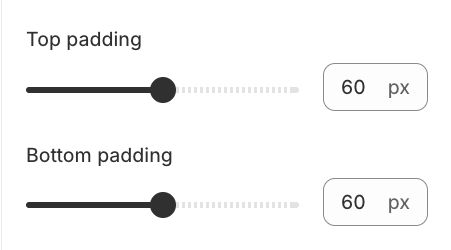
| Top padding | 0 - 27 |
| Bottom padding | 0 - 27 |
| Dividers | None Top only Bottom only Both |
| Force dividers full width | |
| Color scheme | Default Inverse Soft Accent Accent inverse Overlay Color scheme 1 Color scheme 2 |
| Anchor ID | Link directly to the section on any page. Learn more |