Fluorescent
Stiletto
Stiletto
  • Stiletto Help Center
    • Start using Stiletto
      • Theme licenses
      • Migrate your theme
    • FAQs
    • Video tutorials
    • Changelog
  • General
    • Editing themes
      • Adding sections
      • Using templates
      • Accessibility
      • Customizing your site
      • SEO for Shopify themes
      • H1 heading tags
      • Online store speed
    • Image guide
      • Web ready photography
      • Image sizes
      • File formats
      • Theme image settings
    • Adapting theme content
      • Edit default theme content
      • Multiple languages
      • Dynamic content with metafields
      • Unique content for markets
    • Update your theme
  • Theme styles
    • Theme settings
    • Style presets
      • Demo layouts
    • Fonts
    • Colors
    • Animation
  • Pages
    • Templates
      • About page
      • Blog page
      • Blog posts
      • Collections list
      • Contact page
      • Customer accounts
      • FAQ page
      • Lookbook
      • Password page
      • Search page
      • Store locations
      • 404 page
      • Home page
    • Announcement bar
    • Header
      • Layout and style
      • Logo
      • Transparent header
      • Mega menus
      • Mobile menu
      • Quick search
      • Language and currency
      • Social media icons
      • Customer account icon
    • Footer
      • Links block
      • Newsletter block
      • Text and image block
      • Language and currency
      • Payment icons
      • Custom Liquid
  • Sections
    • Theme sections
      • Using sections
      • Content blocks
      • Blog posts
      • Collapsible row list
      • Collection list grid
      • Collection list slider
      • Complete the look
      • Contact form
      • Countdown banner
      • Countdown bar
      • Events
      • Featured collection grid
      • Featured collection slider
      • Featured product
      • Gallery carousel
      • Grid
      • Image compare
      • Image hero
      • Image hero split
      • Image with text
      • Image with text split
      • Multi column
      • Newsletter
      • Newsletter compact
      • Promotion banner
      • Promotion bar
      • Quotes
      • Recently viewed products
      • Rich text
      • Sales banner
      • Scrolling content
      • Shoppable image
      • Shoppable image editorial
      • Slideshow
      • Testimonials
      • Video
      • Video hero
      • Video with text
    • Popups
      • Sign up popup
      • Age verification
      • Countdown popup
      • Promotional popup
  • Products
    • Product listings
      • Product card style
    • Prices and discounts
    • Product badges
    • Quick shop
  • Product pages
    • Product template
      • Alternate templates
      • Pre-order template
      • Gift card
    • Layout and style
      • Product tabs
      • Media gallery
      • Sticky product details
      • Breadcrumbs
      • Navigation buttons
    • Overview blocks
      • Default blocks
        • Description
        • Product header
        • Variant selector
        • Quantity selector
        • Buy buttons
        • Local pickup banner
        • Share icons
        • Sticky add-to-cart bar
      • Collapsible rows block
      • Complementary products
      • Custom options
      • Image block
      • Information popup
      • Product labels
      • Secure payment
      • Stock level indicator
      • Text block
      • Text list with icons
      • App blocks
    • Variant options
      • Variant chips
      • Variant swatches
        • Enable swatches
        • Use default colors
        • Use custom colors
        • Use variant images
        • Use custom images
        • Change swatch styles
        • Show on product cards
        • Dynamic option availability
      • Media grouping
      • Sibling product swatches
    • Product page sections
      • Product reviews
      • Product recommendations
  • Collection pages
    • Collection template
      • Collection landing
      • Sale collection
      • Subcollections
      • Flash sale
    • Banner
    • Product grid
    • Filters and sorting
  • Cart
    • Cart page
    • Quick cart
      • Added to cart popup
      • Empty cart promotion
    • Free shipping bar
    • Low inventory warning
    • Cross sells
  • Support
    • Support policy
    • Shopify vs Theme issues
    • Store access requests
  • For developers
    • Custom CSS
    • Custom fonts
    • Custom Liquid
    • Custom JavaScript events
    • Edit Theme JavaScript
Powered by GitBook
On this page
  • Select collections to show
  • Change layout
  • Change image aspect ratio
  • Change collection title style

Was this helpful?

  1. Pages
  2. Templates

Collections list

Last updated 3 months ago

Was this helpful?

The Collections list template provides the layout and design of the /collections page that displays your store's collections in a grid. Use this page to give customers an overview of all or selected collections.

See demos: | | |

Select collections to show


By default, the Collection list shows all published collections. You can choose to display only Selected collections. To customize your list, choose 'Selected' and add collection to the collection list

Click Collection list page section to find settings

Setting
Description
Options

Select collections to show

Choose which collections to display on the page.

All Default Selected

Change layout


Change the number of columns to display for desktop and mobile screens.

Click Collection list page section to find settings

Setting
Description
Options

Number of columns on desktop

Select the number of collections per row on desktop screens.

3 4 5

Number of columns on mobile

Select the number of collections per row on mobile screens.

1 2

Number of rows on desktop

Set the number of rows to display on desktop.

3 - 10

Change image aspect ratio


Change the aspect ratio to crop images to be a uniform shape.

The aspect ratio of an image is the proportion between its width and height (w:h). A square image has equal width and height (1:1), whereas most images are either wider (2:1) or taller (1:2).

Click Collection list section to find settings

Setting
Description
Options

Aspect ratio

Select an aspect ratio to crop images to be a uniform shape, or select Natural to display images in their original shape.

Natural Default Portrait (2:3) Square (1:1) Landscape (3:2)

Change collection title style


Customize the position and style of the collection title.

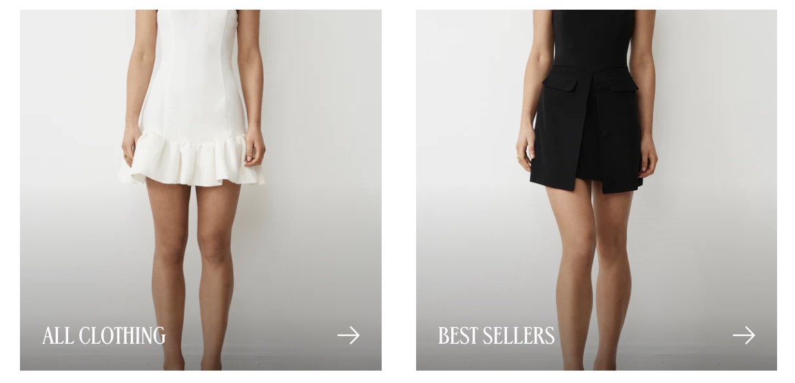
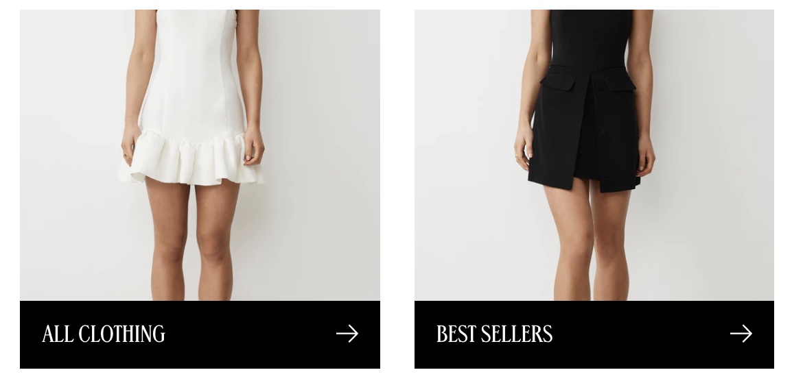
  • Set the Collection listing title style to Overlay or Beneath.

  • Set the Collection title background style to Solid or Gradient.

Click Collection list page section to find settings

Setting
Description

Collection listing title style

Select the number of collections per row on desktop screens.

Overlay title background style

For overlay style, display a Solid or Gradient color background.

Overlay title

Set the color of the collection title.

Overlay title background

Set the background color of the collection title.


Related links

Collections are created and edited in your Shopify admin. See Shopify's to learn how to group products into collections.

Collections manual ↗
Templates
Vogue
Craft
Organic
Chic
Overlay title style
Solid overlay background