Fluorescent
Stiletto
Stiletto
  • Stiletto Help Center
    • Start using Stiletto
      • Theme licenses
      • Migrate your theme
    • FAQs
    • Video tutorials
    • Changelog
  • General
    • Editing themes
      • Adding sections
      • Using templates
      • Accessibility
      • Customizing your site
      • SEO for Shopify themes
      • H1 heading tags
      • Online store speed
    • Image guide
      • Web ready photography
      • Image sizes
      • File formats
      • Theme image settings
    • Adapting theme content
      • Edit default theme content
      • Multiple languages
      • Dynamic content with metafields
      • Unique content for markets
    • Update your theme
  • Theme styles
    • Theme settings
    • Style presets
      • Demo layouts
    • Fonts
    • Colors
    • Animation
  • Pages
    • Templates
      • About page
      • Blog page
      • Blog posts
      • Collections list
      • Contact page
      • Customer accounts
      • FAQ page
      • Lookbook
      • Password page
      • Search page
      • Store locations
      • 404 page
      • Home page
    • Announcement bar
    • Header
      • Layout and style
      • Logo
      • Transparent header
      • Mega menus
      • Mobile menu
      • Quick search
      • Language and currency
      • Social media icons
      • Customer account icon
    • Footer
      • Links block
      • Newsletter block
      • Text and image block
      • Language and currency
      • Payment icons
      • Custom Liquid
  • Sections
    • Theme sections
      • Using sections
      • Content blocks
      • Blog posts
      • Collapsible row list
      • Collection list grid
      • Collection list slider
      • Complete the look
      • Contact form
      • Countdown banner
      • Countdown bar
      • Events
      • Featured collection grid
      • Featured collection slider
      • Featured product
      • Gallery carousel
      • Grid
      • Image compare
      • Image hero
      • Image hero split
      • Image with text
      • Image with text split
      • Multi column
      • Newsletter
      • Newsletter compact
      • Promotion banner
      • Promotion bar
      • Quotes
      • Recently viewed products
      • Rich text
      • Sales banner
      • Scrolling content
      • Shoppable image
      • Shoppable image editorial
      • Slideshow
      • Testimonials
      • Video
      • Video hero
      • Video with text
    • Popups
      • Sign up popup
      • Age verification
      • Countdown popup
      • Promotional popup
  • Products
    • Product listings
      • Product card style
    • Prices and discounts
    • Product badges
    • Quick shop
  • Product pages
    • Product template
      • Alternate templates
      • Pre-order template
      • Gift card
    • Layout and style
      • Product tabs
      • Media gallery
      • Sticky product details
      • Breadcrumbs
      • Navigation buttons
    • Overview blocks
      • Default blocks
        • Description
        • Product header
        • Variant selector
        • Quantity selector
        • Buy buttons
        • Local pickup banner
        • Share icons
        • Sticky add-to-cart bar
      • Collapsible rows block
      • Complementary products
      • Custom options
      • Image block
      • Information popup
      • Product labels
      • Secure payment
      • Stock level indicator
      • Text block
      • Text list with icons
      • App blocks
    • Variant options
      • Variant chips
      • Variant swatches
        • Enable swatches
        • Use default colors
        • Use custom colors
        • Use variant images
        • Use custom images
        • Change swatch styles
        • Show on product cards
        • Dynamic option availability
      • Media grouping
      • Sibling product swatches
    • Product page sections
      • Product reviews
      • Product recommendations
  • Collection pages
    • Collection template
      • Collection landing
      • Sale collection
      • Subcollections
      • Flash sale
    • Banner
    • Product grid
    • Filters and sorting
  • Cart
    • Cart page
    • Quick cart
      • Added to cart popup
      • Empty cart promotion
    • Free shipping bar
    • Low inventory warning
    • Cross sells
  • Support
    • Support policy
    • Shopify vs Theme issues
    • Store access requests
  • For developers
    • Custom CSS
    • Custom fonts
    • Custom Liquid
    • Custom JavaScript events
    • Edit Theme JavaScript
Powered by GitBook
On this page
  • Set up secure payment block
  • Advanced: Add or remove payment icons

Was this helpful?

  1. Product pages
  2. Overview blocks

Secure payment

Last updated 3 months ago

Was this helpful?

In the Product template, you can add a Secure payment block to display a payment and security message with icons of accepted payment methods.

The theme automatically displays icons for the payment options enabled in your Shopify admin, depending on your customer's region and currency. Payment methods are a Shopify feature. See Shopify's to learn more.

Set up secure payment block


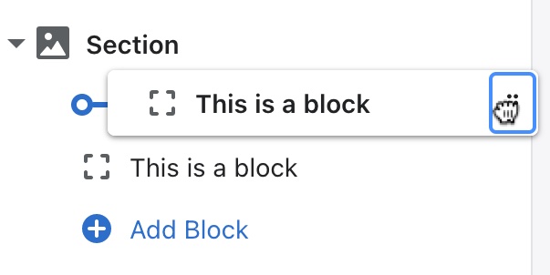
Under Product overview, click (+) Add block and select Secure payment. Use the drag-and-drop handles ⋮⋮ to re-order blocks.

Click the block to find settings for the layout, headings, and optional image.

STEPS

In your theme editor (Customize):

  1. Under Product overview, click (+) Add block and select Secure payment.

  2. Click on the new Secure payment block to open the settings.

  3. Select which Column to display the Text block: Either the Right (in the product form) or on the Left (beneath the product media).

  4. Select the Text alignment of the heading and text: Either Left or Center.

  5. Select the Text position of the heading and text: Either Above payment icons or Below payment icons.

  6. (Optional.) Choose whether to Display payment icons.

    The block displays icons for accepted payment methods included in your payment gateway. See or contact about issues with payment icons.

  7. Change the Heading text for a title above your secure payments message.

    We recommend a short title of a few words.

  8. Select a Heading icon to display next to the heading.

    Select None at the top of the dropdown to remove the icon.

  9. Change the Text for a message about your secure payment methods.

  10. Select the Text size of the text: Either Small, Medium, or Large.

  11. Under Image, click Select image to upload an image or icon to display below the text.

    Use the Image size to increase or decrease the pixel width of your image.

  12. Choose to display the secure payments block as a Collapsible row.

    As a collapsible row, the products Expand by default. You can choose to disable this option.

    (Optional.) Change the Collapsible row title that appears as the toggle that opens the row when clicked.

  13. (Optional.) Click and hold the drag handles ⋮⋮ to rearrange the blocks:

    Click Remove block in the block settings to delete a block.

    Click the Eye icon to hide or unhide a block.

  14. Click Save.

Advanced: Add or remove payment icons


Our support does not cover custom code. These steps are offered only as a reference. For assistance, we recommend reaching out to a .

If you are familiar with coding, you can edit the payment-icons.liquid file to add or remove payment icons that are displayed.

When editing theme code, always duplicate your current theme and use the unpublished theme copy to test your changes before publishing.

STEPS

From your Shopify admin:

  1. Go to Online store > Themes.

  2. Find your current theme, then click the ... button and select Duplicate theme.

  3. On the duplicated theme, click the ... button and select Edit code.

  4. In the Snippets folder, click payment-icons.liquid to open the file.

  5. Find the following code:

{% for type in enable_payment_types %}

  1. Replace that code with the following code:

```liquid

{% assign enabled_payment_types = 'visa,master,american_express,paypal' | remove: ' ' | split: ',' %} {% for type in enabled_payment_types %}


</div>

7.  Edit the payment type values to change which icons are displayed. Separate each value with a comma.

    > The default list is `visa,master,american_express,paypal`. Find all [available payment values](https://github.com/activemerchant/payment\_icons/tree/master/app/assets/images/payment\_icons). Copy the name but do not include `.svg`

    <figure><img src="../../.gitbook/assets/payment-icons-code.gif" alt=""><figcaption></figcaption></figure>

<!---->

8. Click **Save**.
9. After testing, you can go to your Theme library to **Publish** the duplicated theme with your changes.

</details>
<br>

***

> **Related links**
>
> [Product template](../product-template/)
Payments manual ↗
Shopify's Payments guide ↗
Shopify Support ↗
verified Fluorescent partner