# Stock level indicator
The **Stock level indicator** displays the relative availability of your product with a visual bar that alerts customers when there are limited quantities.
The indicator bar visually represents the remaining percentage of your initial stock quantity, turns red when stock is low, and displays three different messages.
## Set up stock level indicator
***
{% hint style="success" %}
Before adding a **Stock level indicator** block, you need to enable the **Track quantity** option for your product and product variants. See the Shopify guide about how to [set up inventory tracking](https://help.shopify.com/en/manual/products/inventory/track_inventory#set-up-inventory-tracking).
{% endhint %}
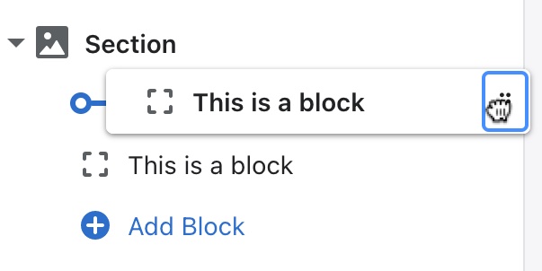
Under **Product overview**, click **(+) Add block** and select **Stock level indicator**. Use the drag-and-drop handles **`⋮⋮`** to re-order blocks.
* Enter an **inventory base quantity** for your product
* Enter a **low level threshold** for when the low-stock alert should appear
STEPS
In your theme editor (**Customize**):
1. Select a **Products** template you want to edit.
2. Click **(+) Add block** and select **Stock level indicator** from the Theme Blocks list.
3. Click on the new **Stock level indicator** block to open the settings.
4. (*Optional*.) Toggle the **Show label** option to display or hide the "Stock" title above the indicator bar.
5. Enter the initial quantity of your product stock level in the **Inventory base quantity** field.
> The indicator bar displays your remaining product quantity as a percentage of this base quantity. If your base quantity is set at 100 products, the bar will display at 100% when your have 100 products in stock and 60% when you have 60 products in stock.
> To learn how to set different base quantities for multiple products, see the [steps for using dynamic sources and metafields](#use-dynamic-sources-for-multiple-products).
6. Enter the product inventory quantity in the **Low quantity threshold** to alert customers when limited quantities are available.
> When your current product inventory matches or goes below the *Low quantity threshold*, the indicator bar will turn red and display a "Limited quantities available" message.
> To learn how to set different *Low inventory thresholds* for multiple products, see the [steps below for using dynamic sources and metafields](#use-dynamic-sources-for-multiple-products).
7. (*Optional*.) Click and hold the drag handles **`⋮⋮`** to rearrange the blocks:

> Click **Remove block** in the block settings to delete a block.
> Click the **Eye icon** to hide or unhide a block.
8. Click **Save**.
## **Use dynamic sources for multiple products**
***
If you need to set a different **Inventory base quantity** and **Low inventory threshold** for multiple products, you can use Shopify's **metafields** and **dynamic sources**.
Follow the steps below to create metafields for your products, add inventory numbers to those metafields, then use **Dynamic sources** to connect metafields to the stock level settings in your theme editor.
> For a general introduction, see our [Dynamic sources and metafields tutorial](https://help.fluorescent.co/stiletto/general/adapting-your-theme/dynamic-content-with-metafields).
### **1. Create number metafield**
Shopify's **Metafields** lets you store additional information about your products. You can create custom fields to hold different types of information in your Shopify admin, and enter unique content for each of your products.
The steps below show you how to add two **Number** metafields for storing an **inventory base quantity** and **Low stock threshold**.
STEPS
In your theme editor (**Customize**):
1. Click the **Stock Level Indicator** block to open the settings.
2. Next to the **Inventory base quantity** field, click the **Insert dynamic source** button and select **(+) Add Metafield**.
3. Click the **Products** tab.

4. Click the **Add definition** button in the top-right.
5. Add a **Name** to the metafield that describes what it will be used for.
> We recommend naming the metafield the same as the setting name: "Inventory base quantity" or "Low stock threshold".

6. Click **(+) Select type** button and select **Number**.
7. (*Optional*.) Repeat steps 4 - 5 to add another metafield for **Low stock threshold**.
8. Click **Save**.
### **2. Add quantity to number metafields**
Once you've created number **Metafields** for your products, you can now add quantities those fields by going to your products in the Shopify admin.
STEPS
In your **Shopify Admin**:
1. Go to your **Product inventory** in your Shopify admin and open one of your **Products**.

2. Scroll down to the **Metafields** section.
3. Enter the **Inventory base quantity** or **Low quantity threshold** that you want for the product.

4. Repeat steps 1 - 3 to add the different quantities to the metafields of the products you want to display a Stock level indicator.
5. Click **Save**.
### **3. Insert metafields as dynamic sources**
Now that the **Metafields** of your products have content, you can go to the theme editor to insert a **Dynamic source** to the **Stock level indicator** settings in the **Products** template.
STEPS
In your theme editor (**Customize**):
1. Click the **Stock Level Indicator** block to open the settings.
2. Delete the current quantity in the **Inventory base quantity** so the field is left blank.
3. Click the **Insert dynamic source** button next to **Customer product list**

4. Select the "Inventory base quantity" metafield you create.
5. (*Optional*.) Click the **Dynamic source** button next to the **Low stock threshold** to add a "Low stock threshold" metafield.
6. You can now preview your store to confirm the correct product list appears when viewing different products.
7. Click **Save**.
\\
***
> **Related links**
>
> [Product template](https://github.com/fluorescent/kb-stiletto/blob/main/product-pages/product-template.md)\
> [Metafields and dynamic sources](https://help.fluorescent.co/stiletto/general/adapting-your-theme/dynamic-content-with-metafields)
---
# Agent Instructions: Querying This Documentation
If you need additional information that is not directly available in this page, you can query the documentation dynamically by asking a question.
Perform an HTTP GET request on the current page URL with the `ask` query parameter:
```
GET https://help.fluorescent.co/stiletto/product-pages/product-page-blocks/stock-level-indicator.md?ask=
```
The question should be specific, self-contained, and written in natural language.
The response will contain a direct answer to the question and relevant excerpts and sources from the documentation.
Use this mechanism when the answer is not explicitly present in the current page, you need clarification or additional context, or you want to retrieve related documentation sections.