# Use custom colors
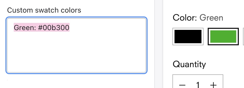
In ***Theme settings > Products***, you can assign custom colors to product variants using a **hex code color** (e.g. **`#00b300`**). Custom colors will override any default colors.
* In the **Custom swatch colors** field, list up to 100 variant names followed by a colon and the hex code (e.g. “Green: #00b300”).
* If your store uses **multiple languages**, add each translated variants name on a separate line with the assigned hex code.
{% hint style="info" %}
#### Version update
[Stiletto v5.1.0](https://help.fluorescent.co/stiletto/readme/changelog#id-5.1.0-latest-release) added support for Shopify’s built-in swatches feature. If you've added custom colors or images using Shopify’s category metafields, those swatch values will be used by default on product pages, product cards, and filter options.
Learn more about [adding swatches with category metafields](https://help.shopify.com/en/manual/custom-data/metafields/category-metafields/using-category-metafields).
{% endhint %}
Why are my swatches blank?
Make sure the variant names match the exact spelling from your Shopify admin. If your store uses **multiple languages**, add each translated variant name with the assigned custom hex code on separate lines.
Why aren’t my collection pages loading?
Adding more than 100 custom swatch colors can cause a ‘500’ error on your store and stop collection pages from loading. Consider using [Custom swatch images](https://help.fluorescent.co/stiletto/product-pages/variant-options/variant-swatches/use-custom-images) for larger sets of variant swatches.
## Watch video tutorial
{% embed url="" %}
## Find color hex codes
***
To find the hex code for the color you want, you can use a [HTML color picker like this one](https://htmlcolorcodes.com/). When you choose your color, select and copy the six-character hex code, including the hashtag symbol.
## Add custom colors
***
In ***Theme settings > Products***, list variant names followed by a colon and the hex code (e.g. “Green: #00b300”). If you store uses multiple languages, add each translated variant name with the custom hex code on separate lines.
{% hint style="warning" %}
Adding more than 100 custom swatch colors can cause a ‘500’ error on your store and stop collection pages from loading. Consider using Custom swatch images for larger sets of variant swatches.
{% endhint %}
STEPS
In your theme editor (**Customize**):
1. Click to open the **Theme settings**, then click **Product**.
2. In the **Custom swatch colors** field add the exact name of the **Option value** (e.g. the product variant "Green") followed by a colon and your hex code color (e.g. **`Green: #00b300`**).
> To add more than one custom color, press the 'return' key to add each color on its own line.

> For **sibling products**, use the **Option name** added to the metafield you created. See the [sibling product swatches guide](https://help.fluorescent.co/stiletto/product-pages/variant-options/sibling-product-swatches) to learn more.
3. (*For multiple store languages*) Add the translated variant name for all languages, followed by a colon and the hex code.
> For example, for stores that use English and German, add custom colors for both **`Green`** and **`Grün`** on separate lines.

4. Click **Save**.
***
> **Related links**\
> [Enable swatches](https://help.fluorescent.co/stiletto/product-pages/variant-options/variant-swatches/..#enable-swatches)\
> [Use default color swatches](https://help.fluorescent.co/stiletto/product-pages/variant-options/variant-swatches/use-default-colors)\
> [Use variant image swatches](https://help.fluorescent.co/stiletto/product-pages/variant-options/variant-swatches/use-variant-images)\
> [Upload custom image swatches](https://help.fluorescent.co/stiletto/product-pages/variant-options/variant-swatches/use-custom-images)\
> [Change swatch styles](https://help.fluorescent.co/stiletto/product-pages/variant-options/variant-swatches/change-swatch-styles)\
> [Show swatches on product cards](https://help.fluorescent.co/stiletto/product-pages/variant-options/variant-swatches/show-on-product-cards)\
> [Enable dynamic option availability](https://help.fluorescent.co/stiletto/product-pages/variant-options/variant-swatches/dynamic-option-availability)