
| Section spacing | #section-padding |
| Section animations | #section-animations |
| Setting | Description |
|---|---|
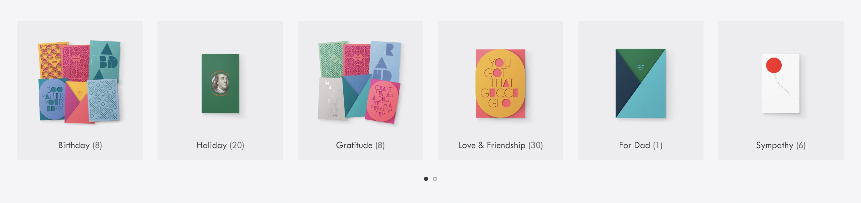
| Show product counts | Choose to display the number of products in each collection. |
| Style | Choose to display collection items with a simple border (Outlined), a solid color background (Filled), or without a border or background (Plain). |
| Image source | Choose to display the Collection image or First product image for the collection items. |
| Image aspect ratio | Choose to crop all images to be a single uniform shape. Select Portrait (2:3), Portrait (4:5), Square (1:1), Landscape (5:4), or Landscape (3:2). Select Natural to display images in their original shape (without cropping). Learn more about aspect ratios in our Image settings guide. |
| Apply circle crop to images | Choose to crop all images to appear as circles. This setting applies only when the Image aspect ratio is set to Square. |
| Image spacing | Change the spacing around the images. Select Comfortable for more spacing or Compact for less. |
| Title font | Set the collection title font to the Body or Heading font selected in your theme settings. |
| Title alignment | Display headings either to the Left, Center, or Right, underneath the collection item image. |
Mobile 4 column layout

Mobile slider enabled
| Setting | Description |
|---|---|
| Number of columns on desktop | Choose how many collections to show per row on desktop screens: either 4, 5, or 6 columns. |
| Number of rows on desktop | Choose how many rows of collection items to display on desktop screens. Show all rows or limit the initial number of rows between 1 and 5. A “Show all” button will reveal additional rows. This settings does not apply if you enable the slider. |
| Enable slider on desktop | Display collection list items in a single-row carousel that visitors can rotate through. |
| Number of columns on mobile | Choose how many collections to show per row on mobile screens: either 2, 3, or 4 columns. |
| Number of rows on mobile | Choose how many rows of collection items to display on mobile. Show all rows or limit the initial number of rows between 2 and 5. A “Show all” button will reveal additional rows. This settings does not apply if you enable the slider. |
| Enable slider on mobile | Display collection list items in a single-row carousel that visitors can swipe left and right view more. |
| Setting | Description |
|---|---|
| Center header content | Display headings in the center above the section. Uncheck this option to align headings to the left. |
| Accent | Add text to show a small heading above the main section heading. |
| Heading | Add text to show a main heading above the section. |
| Subheading | Add text to show a subheading below the main heading. |
| Maximum text width | Set the maximum width of heading text between 400 and 1000 pixels. |