Fluorescent
Stiletto
Stiletto
  • Stiletto Help Center
    • Start using Stiletto
      • Theme licenses
      • Migrate your theme
    • FAQs
    • Video tutorials
    • Changelog
  • General
    • Editing themes
      • Adding sections
      • Using templates
      • Accessibility
      • Customizing your site
      • SEO for Shopify themes
      • H1 heading tags
      • Online store speed
    • Image guide
      • Web ready photography
      • Image sizes
      • File formats
      • Theme image settings
    • Adapting theme content
      • Edit default theme content
      • Multiple languages
      • Dynamic content with metafields
      • Unique content for markets
    • Update your theme
  • Theme styles
    • Theme settings
    • Style presets
      • Demo layouts
    • Fonts
    • Colors
    • Animation
  • Pages
    • Templates
      • About page
      • Blog page
      • Blog posts
      • Collections list
      • Contact page
      • Customer accounts
      • FAQ page
      • Lookbook
      • Password page
      • Search page
      • Store locations
      • 404 page
      • Home page
    • Announcement bar
    • Header
      • Layout and style
      • Logo
      • Transparent header
      • Mega menus
      • Mobile menu
      • Quick search
      • Language and currency
      • Social media icons
      • Customer account icon
    • Footer
      • Links block
      • Newsletter block
      • Text and image block
      • Language and currency
      • Payment icons
      • Custom Liquid
  • Sections
    • Theme sections
      • Using sections
      • Content blocks
      • Blog posts
      • Collapsible row list
      • Collection list grid
      • Collection list slider
      • Complete the look
      • Contact form
      • Countdown banner
      • Countdown bar
      • Events
      • Featured collection grid
      • Featured collection slider
      • Featured product
      • Gallery carousel
      • Grid
      • Image compare
      • Image hero
      • Image hero split
      • Image with text
      • Image with text split
      • Multi column
      • Newsletter
      • Newsletter compact
      • Promotion banner
      • Promotion bar
      • Quotes
      • Recently viewed products
      • Rich text
      • Sales banner
      • Scrolling content
      • Shoppable image
      • Shoppable image editorial
      • Slideshow
      • Testimonials
      • Video
      • Video hero
      • Video with text
    • Popups
      • Sign up popup
      • Age verification
      • Countdown popup
      • Promotional popup
  • Products
    • Product listings
      • Product card style
    • Prices and discounts
    • Product badges
    • Quick shop
  • Product pages
    • Product template
      • Alternate templates
      • Pre-order template
      • Gift card
    • Layout and style
      • Product tabs
      • Media gallery
      • Sticky product details
      • Breadcrumbs
      • Navigation buttons
    • Overview blocks
      • Default blocks
        • Description
        • Product header
        • Variant selector
        • Quantity selector
        • Buy buttons
        • Local pickup banner
        • Share icons
        • Sticky add-to-cart bar
      • Collapsible rows block
      • Complementary products
      • Custom options
      • Image block
      • Information popup
      • Product labels
      • Secure payment
      • Stock level indicator
      • Text block
      • Text list with icons
      • App blocks
    • Variant options
      • Variant chips
      • Variant swatches
        • Enable swatches
        • Use default colors
        • Use custom colors
        • Use variant images
        • Use custom images
        • Change swatch styles
        • Show on product cards
        • Dynamic option availability
      • Media grouping
      • Sibling product swatches
    • Product page sections
      • Product reviews
      • Product recommendations
  • Collection pages
    • Collection template
      • Collection landing
      • Sale collection
      • Subcollections
      • Flash sale
    • Banner
    • Product grid
    • Filters and sorting
  • Cart
    • Cart page
    • Quick cart
      • Added to cart popup
      • Empty cart promotion
    • Free shipping bar
    • Low inventory warning
    • Cross sells
  • Support
    • Support policy
    • Shopify vs Theme issues
    • Store access requests
  • For developers
    • Custom CSS
    • Custom fonts
    • Custom Liquid
    • Custom JavaScript events
    • Edit Theme JavaScript
Powered by GitBook
On this page
  • Quick add
  • Quick view
  • Edit Quick view template
  • Change button labels

Was this helpful?

  1. Products

Quick shop

Product listings

Last updated 4 months ago

Was this helpful?

The Quick shop features allow customers to view and add your products directly to their cart without needing to navigate to the product page.

  • The button adds products immediately to your customer's cart.

  • The button reveals a popup with product details and buy button.

Quick add


The Quick add button allows customers to add products immediately to their cart. If products have variants, the button will show "Choose options" and open the Quick view popup when clicked.

If both quick add and quick view are enabled, then quick add will take precedence for available products. Unavailable products will show quick view button if enabled.

Go to Theme settings > Products to find settings

Setting
Description

Enable quick add

When enabled, the "Quick add" button appears on products across your site that adds products immediately to their cart.

Quick view


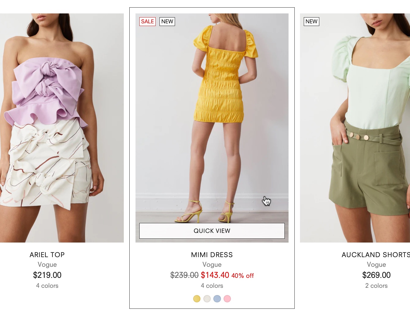
The quick view button appears when customers hover over products in collections or sections.

When clicked, the quick view popup allows customers to view and add products directly to their cart without going to the product page.

Go to Theme settings > Products to find settings

Setting
Description

Enable quick view

When enabled, the "Quick view" button appears on products across your site that opens a popup with product details and buy button.

Edit Quick view template


By default, the quick view popover displays basic product details, variant selector, and quantity selector.

You can change the appearance of the popover by editing the Quick view template in the theme editor.

1

In the theme editor, use the template selector to go to products > quick-view.

2

Click the Product quick view section to find settings for the appearance of the quick view popup.

3

Click the Blocks to find settings for the Variant selector, Stock level indicator, Quantity selector, and Description.

Quick view blocks

Click blocks to find settings

Setting
Description

Display product description as a paragraph or accordion.

Let customers add more quantities of a product.

Display stock level bar with 'low inventory' alert.

Add the Share block to display social links for sharing your product page.

Product quick view

Click Product quick view section to find settings

Setting
Description

Show divider

Show border line beneath the product details.

Show vendor

Show the vendor name beneath the product title.

Show SKU

Show the "Stock-keeping unit" (SKU) number of the product.

Show discount

Show discount amount as set up in the 'compare at price' setting in the Shopify admin.

Discount format

Choose to display discounts by percentage or currency amount.

Show product rating

Show sale badge

Show sale label for products that have a Compare at price set in your Shopify admin.

Show custom badges

Show recipient information form for gift cards

Allow customers to send gift cards to a recipient's email on a scheduled date, along with a personal message.

Change button labels


By default, the quick view and quick add buttons use default wording: "Quick view", "Add to bag", or "Choose options".

To change these button labels, you can use the Default theme content editor.

STEPS

In the theme editor (Customize):

  1. Click the Actions ... menu at the top of the theme editor.

    You can also open the Actions menu next to your theme in the Online store section of your Shopify admin.

  2. Select Edit default theme content.

  3. Enter the default text into the search bar.

  4. Find the text field and replace it with your own wording.

  5. Click Save.


Display variants of product options. Includes options for , , and . If you have set up, those swatches will appear in the section and will change the product media and details when selected.

Show star rating from your product rating app. Learn more in the .

Show custom badges added to your theme settings. Learn how to set up .

Related links

Product listings
Purchase confirmation popup
Quick cart
Information popup
Variant swatches
Variant chips
Sibling product swatches
Stock level indicator
product review guide
Product badges
Quick add
Quick view
Description
Variant selectors
Quantity selector
Share icons
Quick view popup