Fluorescent
Eclipse
Eclipse
  • Get started
    • Migrating to Eclipse
    • Theme license
  • FAQs
  • Changelog
    • Update your theme
  • General
    • Editing themes
      • Dynamic content with metafields
      • Edit default theme content
      • Multiple languages
      • Unique content for markets
      • Customizing your site
      • H1 heading tags
    • Image guide
      • Web ready photography
      • Image sizes
      • File formats
      • Theme image settings
    • SEO for Shopify
    • Online store speed
    • Accessibility
  • Theme settings
    • Theme settings
      • Social media
    • Theme styles
    • Fonts
    • Colors
  • Corner rounding
  • Pages
    • Page templates
      • Using templates
      • Customize page styles
      • Create and assign templates
    • Demo layouts
    • About page
    • Home page
    • Blog page
    • Blog post
    • Contact page
    • Password page
    • Search page
  • Sections
    • Sections
      • Using sections
      • Content blocks
    • Blog posts
    • Collapsible content
    • Collection list
    • Contact form
    • Featured collection
    • Featured links
    • Feature product
    • Grid
    • Icon with text columns
    • Image hero
    • Image with text
    • Multi-column
    • Newsletter
    • Rich text
    • Scrolling content
    • Shop the look
    • Shoppable feed
    • Slideshow
    • Video
    • Video hero
    • Video with text
    • Custom Liquid
  • Header
    • Announcement bar
    • Header
      • Layout and style
      • Logo
      • Transparent header
      • Mega menu
      • Language and Currency
    • Impact logo
    • Search
  • Footer
    • Footer
      • Image Text and Socials
      • Links block
      • Newsletter and Socials
      • Language and Currency
      • Custom Liquid
  • Products
    • Product listings
      • Product card styles
      • Sale and sold out badges
      • Quick shopping
    • Prices and currencies
    • Swatches
      • Use default colors
      • Use custom colors
      • Use custom images
  • Product pages
    • Product page
      • Gift card product
    • Media gallery
      • Media grouping
    • Product overview blocks
      • Description
      • Price
      • Buy buttons
      • Collapsible row
      • Complementary products
      • Custom option
      • Featured icon with text
      • Icon with text
      • Inventory status
      • Image block
      • Popup block
      • Product rating
      • Text block
      • Share icons
      • Custom Liquid
    • Variant selector
      • Info popup
    • Sticky add-to-cart
    • Sibling products
    • Product recommendations
  • Collections
    • Collection page
      • Banner
      • Product grid
      • Promotion tiles
      • Filters and sorting
    • Collection list page
  • Cart
    • Cart
    • Free shipping bar
    • Cross sells
  • Popups
    • Popups
  • Support
    • Support policy
    • Shopify vs Theme issues
    • Store access requests
  • Advanced
    • Custom CSS
    • Custom fonts
Powered by GitBook
On this page
  • Set up section
  • Section layout
  • Add column blocks
  • Add image or video
  • Add heading and text
  • Add button
  • Customize column styles
  • Change text layout and size
  • Choose button style
  • Change image and video layout

Was this helpful?

  1. Sections

Multi-column

Last updated 14 days ago

Was this helpful?

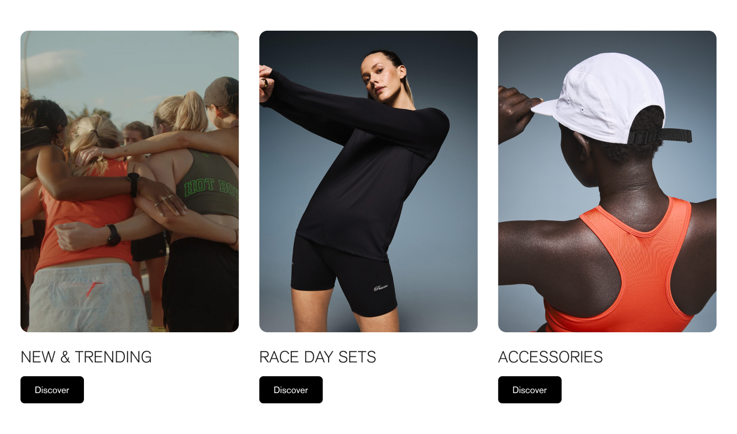
The Multi-column section allows you to pair images, text, and buttons in a flexible layout. You can display multiple columns in a grid or a single-row slider.

  • Add multiple columns with images, autoplay videos, text, and/or buttons.

  • Customize the shape, size, and position of images and videos

  • Change the alignment of text and buttons

You can add different combinations of content for the columns. For example, add columns of images (without text) or only text (without images).

Set up section


In the editor side panel, click (+) Add section and select Multi-column. Click and hold the drag handles ⋮⋮ to re-order sections.

Click the section to add a section header and change section styles for colors and spacing.

Section layout


In the section settings, you can adjust the overall layout of the column blocks.

  • Choose the number of columns to display per row

  • Change the amount of spacing between columns

  • Display columns in a Grid (multiple rows) or Slider (single row)

Click section to find settings

Setting
Description
Options

Column spacing

Choose the amount of spacing between column blocks.

Small Medium Default Large

Number of columns on desktop

Select the number of columns to display on desktop screens.

2 3 Default 4

Number of columns on mobile

Select the number of columns per row on mobile screens.

1 Default 2

Enable slider on desktop

When enabled, columns appear in a single row with scroll buttons.

Enable slider on mobile

When enabled, columns appear in a single row with scroll buttons. Visitors can also swipe to scroll through.

Show slider indicator

When enabled, a bar below the columns shows how far visitors have scrolled.

Add column blocks


Add column blocks with images, videos, text, and/or buttons.

  • In the Multi-column section, click (+) Add Column.

  • Click and hold the drag handles ⋮⋮ to rearrange the blocks.

  • Click the Column block to add content.

You can show columns with only images or videos by deleting the columns text and heading fields. You can show columns with only text by deselecting the Display media option.

Add image or video


Add an image or autoplay video (without sound) as the column background.

For autoplay videos, make sure your video files meet the following requirements:

Video file type

.mp4 or .mov Embedded YouTube or Vimeo videos are not supported.

Video length

< 20 seconds (Recommended)

Video size

< 10MB (Recommended)

Click Column block to find settings

Setting
Description

Display media

Uncheck this option for columns blocks without an image or video.

Make media full height

If the column block only has an image or video without any text or button, checking this option will make the image or video span the full height of the row.

Image

Select or upload an image.

Video

Add a short autoplay video (without sound) to replace the image.

Mobile image

Select or upload an alternate image to display on mobile devices.

Add heading and text


Change the Heading and Text in the column block, or delete the text in these fields to remove them.

Click Column block to find settings

Setting
Description

Heading

The title of the column.

Text

Add multiple lines of rich text. Use the buttons to make the text bold or italicized, or to add a link.

Add button


Add a link and label for the column button. To remove the button, delete the text in the Button label field.

Click Column block to find settings

Setting
Description
Options

Button link

The URL that you want the button to link to.

Button label

The text that displays on the button.

Default: "Button"

Customize column styles


Change the overall style of text, buttons, and media of all column blocks.

Change text layout and size


Change the alignment and size of column text and headings.

Click Multi-column section to find settings

Setting
Description
Options

Text alignment

Set the position of the text content for desktop screens.

Left Default Center Right

Heading size

Change the size of the heading text from small to large.

1-8 Default: 2

Heading tag

Change the heading tag to modify the page structure. Use H2 to indicate important topics, and use H3-H6 for related topics. This option doesn't change the heading's appearance.

H2 - H6

Text size

Adjust the size of the section text from small to large.

1-8 Default: 3

Choose button style


Change the visual style of column buttons. The button colors use the selected color scheme in the section settings.

Click Multi-column section to find settings

Setting
Description
Options

Button style

Change the style of the button.

Solid Default Outline Text

Change image and video layout


Change the aspect ratio (shape) and position of all column images and videos.

Click Multi-column section to find settings

Setting
Description
Options

Media aspect ratio

Select an aspect ratio to crop images to be a uniform shape, or select Natural to display images in their original shape.

Natural Default Portrait (2:3) Portrait (4:5) Square (1:1) Landscape (5:4) Landscape (3:2) Landscape (16:9) Landscape (21:9)

Media position

Show the image or video above or below the column content.

Above content Default Below content

Editing templates will change all pages that use the same template. for different page layouts, or in the same template.

Create new templates
show dynamic page content

Section header

Section colors

Width and Padding