Fluorescent
Eclipse
Eclipse
  • Get started
    • Migrating to Eclipse
    • Theme license
  • FAQs
  • Changelog
    • Update your theme
  • General
    • Editing themes
      • Dynamic content with metafields
      • Edit default theme content
      • Multiple languages
      • Unique content for markets
      • Customizing your site
      • H1 heading tags
    • Image guide
      • Web ready photography
      • Image sizes
      • File formats
      • Theme image settings
    • SEO for Shopify
    • Online store speed
    • Accessibility
  • Theme settings
    • Theme settings
      • Social media
    • Theme styles
    • Fonts
    • Colors
  • Corner rounding
  • Pages
    • Page templates
      • Using templates
      • Customize page styles
      • Create and assign templates
    • Demo layouts
    • About page
    • Home page
    • Blog page
    • Blog post
    • Contact page
    • Password page
    • Search page
  • Sections
    • Sections
      • Using sections
      • Content blocks
    • Blog posts
    • Collapsible content
    • Collection list
    • Contact form
    • Featured collection
    • Featured links
    • Feature product
    • Grid
    • Icon with text columns
    • Image hero
    • Image with text
    • Multi-column
    • Newsletter
    • Rich text
    • Scrolling content
    • Shop the look
    • Shoppable feed
    • Slideshow
    • Video
    • Video hero
    • Video with text
    • Custom Liquid
  • Header
    • Announcement bar
    • Header
      • Layout and style
      • Logo
      • Transparent header
      • Mega menu
      • Language and Currency
    • Impact logo
    • Search
  • Footer
    • Footer
      • Image Text and Socials
      • Links block
      • Newsletter and Socials
      • Language and Currency
      • Custom Liquid
  • Products
    • Product listings
      • Product card styles
      • Sale and sold out badges
      • Quick shopping
    • Prices and currencies
    • Swatches
      • Use default colors
      • Use custom colors
      • Use custom images
  • Product pages
    • Product page
      • Gift card product
    • Media gallery
      • Media grouping
    • Product overview blocks
      • Description
      • Price
      • Buy buttons
      • Collapsible row
      • Complementary products
      • Custom option
      • Featured icon with text
      • Icon with text
      • Inventory status
      • Image block
      • Popup block
      • Product rating
      • Text block
      • Share icons
      • Custom Liquid
    • Variant selector
      • Info popup
    • Sticky add-to-cart
    • Sibling products
    • Product recommendations
  • Collections
    • Collection page
      • Banner
      • Product grid
      • Promotion tiles
      • Filters and sorting
    • Collection list page
  • Cart
    • Cart
    • Free shipping bar
    • Cross sells
  • Popups
    • Popups
  • Support
    • Support policy
    • Shopify vs Theme issues
    • Store access requests
  • Advanced
    • Custom CSS
    • Custom fonts
Powered by GitBook
On this page
  • Add sections
  • Add blocks
  • Section header
  • Section styles
  • Color schemes
  • Edit color schemes
  • Overlay colors
  • Section width
  • Section padding

Was this helpful?

  1. Sections
  2. Sections

Using sections

Last updated 9 days ago

Was this helpful?

Sections are the basic components of templates. You can add, rearrange, and customize sections to create the layout and content of your pages.

Add sections


Sections are listed in the theme editor sidebar in the order they appear on the page.

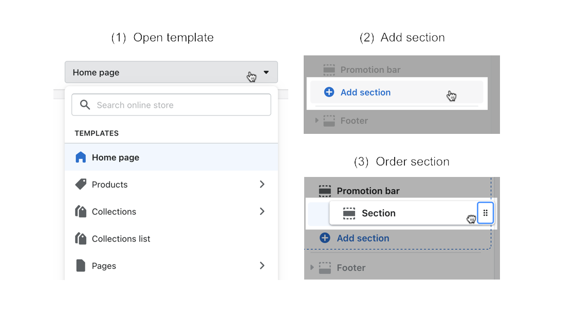
  • Click the (+) Add section button in the theme editor sidebar.

  • Use the drag handles (⋮⋮) to change the order of your sections and blocks

  • Use the Remove section button to delete them or click the eye icon to hide them.

Editing templates will change all pages that use the same template. for different page layouts, or in sections using the same template.

Add blocks


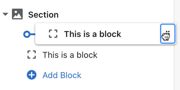
Most sections are made up of individual Blocks for text, media, buttons, or other content, which are nested under sections in the editor panel.

  • Click (+) Add block button to add or select the type of block you wish to add.

  • Click the block to open the block settings.

Section header


Click the section to find the header settings.

  • Add a heading, text, and optional link.

  • To remove the section header, delete any text in these fields.

Click the section to find settings

Setting
Description

Heading

Change or remove the title of the section.

Heading tag

Text

Add multiple lines of rich text below the heading.

Link URL

Select a page or URL for the link.

Link label

Add text to display the link.

Section styles


All sections include general style options for Colors and Spacing. In the editor side panel, click the section to find settings for Color scheme, Section width, and Section padding.

Color schemes


You can change the section or block colors by assigning a color scheme using the color scheme picker.

Click the section or block to find the Color scheme option.

A color scheme consists of a set of colors that you can use for sections throughout your store. Color schemes help you create consistent palettes.

Edit color schemes


You can add and define different color schemes in Theme settings > Colors. These color schemes will appear as options in section and block settings.

In Theme settings, click a color scheme to edit its color options. Click (+) Add scheme to add a new color scheme.

Color scheme options

Every color scheme has the following color options.

General colors
Description

Background

The background of the section, which spans the full height and width.

Background gradient

Text

All text included in the section.

Lines and borders

All lines and borders that appear between or within sections.

Accent

Special design elements in sections

Accent foreground

Text or icons that overlay accent elements

Buttons

Solid buttons

The background and text colors for buttons with solid style

Outline buttons

The background, text, and border colors for buttons with outline style

Buttons with icon

The background and foreground colors for buttons with icons

Overlay colors


1

In the section or block settings, select a color scheme.

2

Use the overlay opacity slider to make the tint more or less transparent.

Set the opacity to 0% to turn off the tint overlay.

Click the section or block to find settings

Setting
Description
Options

Overlay opacity

Use the slider to change the transparency of the overlay. Set the opacity to 0% to turn off the overlay.

0 - 100 %

Section width


Change the Section width to adjust how far the section spans across the page. In the section settings, find Width options under Section.

  • The page width has a fixed width of 1600px

  • Other width options adapt to the visitor's browser width

Section padding


Use the sliders to add space at the top and bottom of the section. Set to 0 to remove spacing.

Some sections have a Section header that appears above the main content. Other section may use or overlay text for the main headings.

Change the heading tag to modify the page structure. Use H2 to indicate important topics, and use H3-H6 for related topics. Learn how to . This option doesn't change the heading's appearance.

Some sections can use a gradient background instead of a solid color background. You can choose the style, angle, position, and opacity of the gradient. See Shopify's to learn more.

When text appears over images or videos, an overlay color is used to provide contrast between the text and background, keeping it readable and .

The overlay uses the color scheme's background color. If the color scheme has a background gradient, it will be used instead. Background gradients fade across a range of hues. Learn more in Shopify's .

Set the opacity to 100% to create solid color blocks or banners in sections like , , or .

Width options were updated in v4.0. View the and to access new features.

Available page width options vary depending on the type of section. The Full width (background only) is available only for , , , and .

content blocks
accessible for everyone
color gradient guide ↗
Grid
Image hero
Slideshow
changelog
update your theme
Slideshow
Image hero
Video hero
Newsletter
Collection banner
color gradient guide ↗
Create new templates
show dynamic page content
Cover

Page width

Section background and content span the page width (1600px).

Cover

Full width (padded)

Section background spans the screen's full width with some padding, and content spans the width of the background.

Cover

Full width (background only)

Section background media spans the full screen and content spans the page width (1600px)

Cover

Full width

Both section background and content span the screen's full width.

Highlighted areas of the Shopify theme editor showing how to open templates, add sections, and re-order sections.
replace default H1 headings