Grid
Theme section
Last updated
Theme section
Last updated
The Grid section displays a flexible collage of feature images. Mix and match between different size blocks and reorder them to create a promotional feature or lookbook layout.
Add this section to any template (except Checkout) and use the drag-and-drop handles to re-order its position. You can add this section multiple times with different content and settings.
Editing a template changes all pages that use that template. To edit specific pages, you can you can create new templates or insert dynamic content with metafields.
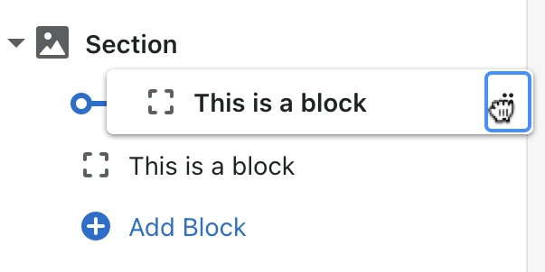
Add Grid item blocks with adjustable widths. Create different layouts by reordering the blocks with the drag-and-drop handles ⋮⋮ and customize the width and height of each block.
Each grid block can have up to three types of headings. Adjust the position, width, and color of your headings to match your image.
Add a Button Label and Link to display a button. Leave the Button label blank to make the entire block a clickable link.
Click the Grid item block to find the following settings.
Width
Choose the width of the grid item as a percentage of the section width. Select 100%, 66%, 50%, 33%, or 25%.
Image
Select an image to display as the grid item background. The image will override the color scheme and use the overlay colors selected in your theme settings. There are no required image dimensions. We recommend a minimum width or height of 2500px.
Image focal point
Select the most important part of the image to keep centered. Use focal points to avoid unwanted cropping across different screen sizes. You can specify a focal point for an image used within a section or for an uploaded image file. Learn more in our Image settings guide.
Tint opacity
Use the slider to adjust the transparency of the overlay color. Set the opacity to 0% to turn off the overlay color. If set to 100%, the overlay will be opaque.
Tint style
Choose to use a Solid overlay color or Gradient overlay for the tint. The gradient style fades across a range of hues. You can select the angle and direction of the gradient from one of four options.
Override with custom colors
Check this option to use custom overlay colors for the tint. These colors will override the overlay colors selected in your theme settings.
Text color
Select a custom color for the heading and text of the “View all” tile. This setting applies only if the Override with custom colors option is enabled.
Tint color
Select a custom overlay text color for the tint. This setting applies only if the Override with custom colors option is enabled.
Text position
Choose the placement of the headings within the grid item. Select one of nine positions.
Mobile text position
Choose the placement of the headings within the grid item. Select one of nine positions.
Accent
Add text to show a small heading above the main heading.
Accent divider
Choose to show a border beneath the Accent heading.
Accent divider color
Choose to use the Theme color (as selected in the theme settings) or the Current color (as selected in the section settings).
Heading
Add text to show a main heading.
Heading size
Change the font size of the heading from small (1) to large (8).
Text
Add text to show a subheading below the main heading.
Text size
Change the font size of the text from small (1) to large (8).
Maximum text width
Set the maximum width of heading text between 400 and 1000 pixels.
Button link
Select or paste a URL for a button. This link applies to the entire grid item if the button label field is blank.
Button label
Enter call-to-action text to display as the button label. The most effective button labels ask customers to do something (e.g. Get started, Join us, Shop now).
Button style
Change the style of the button. Select Primary button (Solid), Secondary button (Solid), Tertiary button (Outline), or Text.
Tint opacity
Use the slider to adjust the transparency of the overlay color. Set the opacity to 0% to turn off the overlay color. If set to 100%, the overlay will be opaque.
Tint style
Choose to use a Solid overlay color or Gradient overlay for the tint. The gradient style fades across a range of hues. You can select the angle and direction of the gradient from one of four options.
Override with custom colors
Check this option to use custom overlay colors for the tint. These colors will override the overlay colors selected in your theme settings.
Text color
Select a custom color for the heading and text of the “View all” tile. This setting applies only if the Override with custom colors option is enabled.
Tint color
Select a custom overlay text color for the tint. This setting applies only if the Override with custom colors option is enabled.
Click the Grid section to find the following settings.
Center header content
Choose to display headings as center-aligned within section. Uncheck this option to align headings to the left.
Accent
Add text to show a small heading above the main section heading.
Heading
Add text to show a main heading above the section.
Subheading
Add text to show a subheading below the main heading.
Maximum text width
Set the maximum width of heading text between 400 and 1000 pixels.
Enable full width
Choose to display headings as center-aligned within section. Uncheck this option to align headings to the left.
Grid spacing
Increase or decrease the spacing between the grid blocks: between 0 and 50 pixels.
Color scheme
Change the color scheme applied to the section text and background. Select the Default color scheme from your theme settings or select a variant scheme based on the default colors: either Inverse, Soft, Accent, or Sale. You may also select one of the two custom color schemas.
Learn more about Color schemes.
Override with custom colors
Check this option to apply custom colors to the section. These colors will override the color scheme.
Text color
Select a custom color for all text in the section header. This setting applies only if the Override with custom colors option is enabled.
Background color
Select a custom color for the section background. This setting applies only if the Override with custom colors option is enabled.
Section style
Top spacing
Increase or decrease the amount of space above the section.
Bottom spacing
Increase or decrease the amount of space below the section.
Enable animation
Choose whether to display visual effects when scrolling, hovering, or interacting with the section. See the Animation guide to learn more.
Related links Image hero Image with content Multi-column