Fluorescent
Cornerstone
Cornerstone
  • Cornerstone Help Center
    • Start using Cornerstone
      • Migrate your theme
      • Theme licenses
    • FAQs
    • Video tutorials
    • Changelog
  • General
    • Editing themes
      • Adding sections
      • Using templates
      • Accessibility
      • Customizing your site
      • H1 heading tags
      • SEO for Shopify themes
      • Online store speed
    • Image guide
      • Web ready photography
      • Image sizes
      • File formats
      • Theme image settings
    • Adapting theme content
      • Edit default theme content
      • Multiple languages
      • Dynamic content with metafields
      • Unique content for markets
    • Update your theme
  • Theme styles
    • Theme settings
    • Style presets
      • Demo layouts
    • Colors
    • Fonts
    • Animation
  • Pages
    • Templates
      • Home page
      • Blog page
      • Blog posts
      • Collections list page
      • Contact page
      • Customer accounts
      • Password page
      • Search page
      • 404 page
    • Sections
      • Section styles
      • Content blocks
      • Blog posts
      • Collapsible row list
      • Collection list
      • Collection list buttons
      • Contact form
      • Countdown banner
      • Countdown bar
      • Featured collection
      • Featured collection with media
      • Featured product
      • Grid
      • Icon with text columns
      • Image hero
      • Media with content split
      • Multi-column
      • Newsletter
      • Newsletter compact
      • Overlapping media with content
      • Promotion grid
      • Quick links
      • Rich text
      • Sales banner
      • Scrolling content
      • Slideshow
      • Tabbed collections
      • Testimonials
      • Video hero
    • Popups
      • Sign up popup
      • Age verification
      • Countdown signup popup
      • Promotional popup
  • Header
    • Announcement bar
      • Language selector
      • Country selector
      • Social media icons
      • Announcements
    • Header
      • Logo
      • Layout and style
      • Mega navigation
      • Transparent header
    • Mobile menu
    • Search bar
  • Footer
    • Footer
      • Contact and social block
      • Links block
      • Logo block
      • Newsletter and social block
      • Text and image block
      • Language and currency
      • Payment icons
      • Custom liquid
  • Products
    • Product listings
      • Layout and style
      • Product card details
    • Product badges
    • Quick shop
  • Product pages
    • Product template
    • Layout and style
      • Media gallery
      • Sticky product details
      • Recommended products sidebar
      • Breadcrumbs
      • Navigation buttons
      • Gift card recipient form
    • Overview blocks
      • Product header
      • Description
      • Variant selector
      • Buy buttons
      • Share icons
      • Collapsible rows block
      • Complementary products
      • Custom option
      • Customer support block
      • Image block
      • Image with text block
      • Information popup
      • Product labels
      • Payments and trust
      • Stock level indicator
      • Text block
      • Text columns with icons
      • Text list with icons
      • App blocks
    • Variant options
      • Chips
      • Swatches
        • Enable swatches
        • Use default colors
        • Use custom colors
        • Use custom images
        • Change swatch styles
        • Show on product cards
        • Dynamic option availability
      • Sibling product swatches
      • Media grouping
    • Product recommendations
  • Collection pages
    • Collection template
    • Banner
    • Product grid
    • Filters and sorting
  • Cart
    • Cart page
    • Quick cart
      • Added to cart popup
    • Free shipping bar
    • Low inventory warning
    • Cross sells
  • Support
    • Support policy
    • Shopify vs Theme issues
    • Store access requests
  • For developers
    • Custom CSS
    • Custom fonts
    • Custom Liquid
    • Custom JavaScript events
    • Edit Theme JavaScript
Powered by GitBook
On this page
  • Product details
  • Prices and discounts
  • Add product subtitles with metafields

Was this helpful?

  1. Products
  2. Product listings

Product card details

Last updated 3 months ago

Was this helpful?

Go to Theme settings > Product listing to choose which product details to display on product cards, and customize how prices and discounts are displayed.

Product details


Setting
Description

Show vendor

Display vendor name beneath the product information.

Show product subtitle

Show swatches

Show inventory status

Show ‘low stock’ message.

Prices and discounts


Change how the product prices and discounts are displayed.

Setting
Description

Enlarge prices

Choose to display price text at a larger size.

Price position

Choose to display the price Below product title or Above product title. Only applies to "Grid" display mode.

Show discount

Choose to show the discount amount for sale products.

Discount format

Choose to display the discount as a percentage or dollar amount.

Add product subtitles with metafields


You can display a Product subtitle beneath the main title on product cards. This feature uses a standard “Product subtitle” metafield, which you can enable in the Custom data settings of your Shopify admin.

Metafields allow you to store extra information about your products. In your Shopify admin, you can create and populate custom fields for specific parts of your store (such as products).

In your theme editor, you can use dynamic sources to automatically display the correct content from your metafields.

STEPS

In your Shopify admin:

  1. Go to Settings > Custom data.

  2. Select Products.

  3. Click Add definition.

  4. In the Name field, search and select “Product subtitle”.

    The Product subtitle is a standard metafield, which means it’s automatically configured by Shopify and design to be compatible across all Shopify stores.

  5. (Optional.) You can choose to enable Features to expand how you can use the metafield in your Shopify admin.

    To use this metafield as a filter for searching your products in the Shopify admin, select Use as filter in admin.

    To allow this metafield to be used for creating automated collections, select Use in automated collections.

  6. Click Save.

To populate the Product subtitle metafield:

  1. From your Shopify admin, go to Products and open the products that you want to add subtitles.

  2. Scroll down to the Metafields area, and enter a short subtitle in the Product subtitle field.

  3. Click Save.

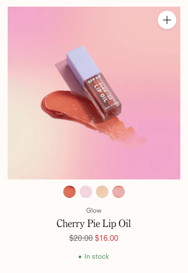
Choose to show vendor names, swatches, and an inventory status message on product cards. You can also show Product subtitles — to set up product subtitles using metafields.

Show the product subtitle from a metafield added to your products. .

Show on hover.

see instructions below
Variant swatches
See the steps below
Card with swatches, vendor, and inventory status.
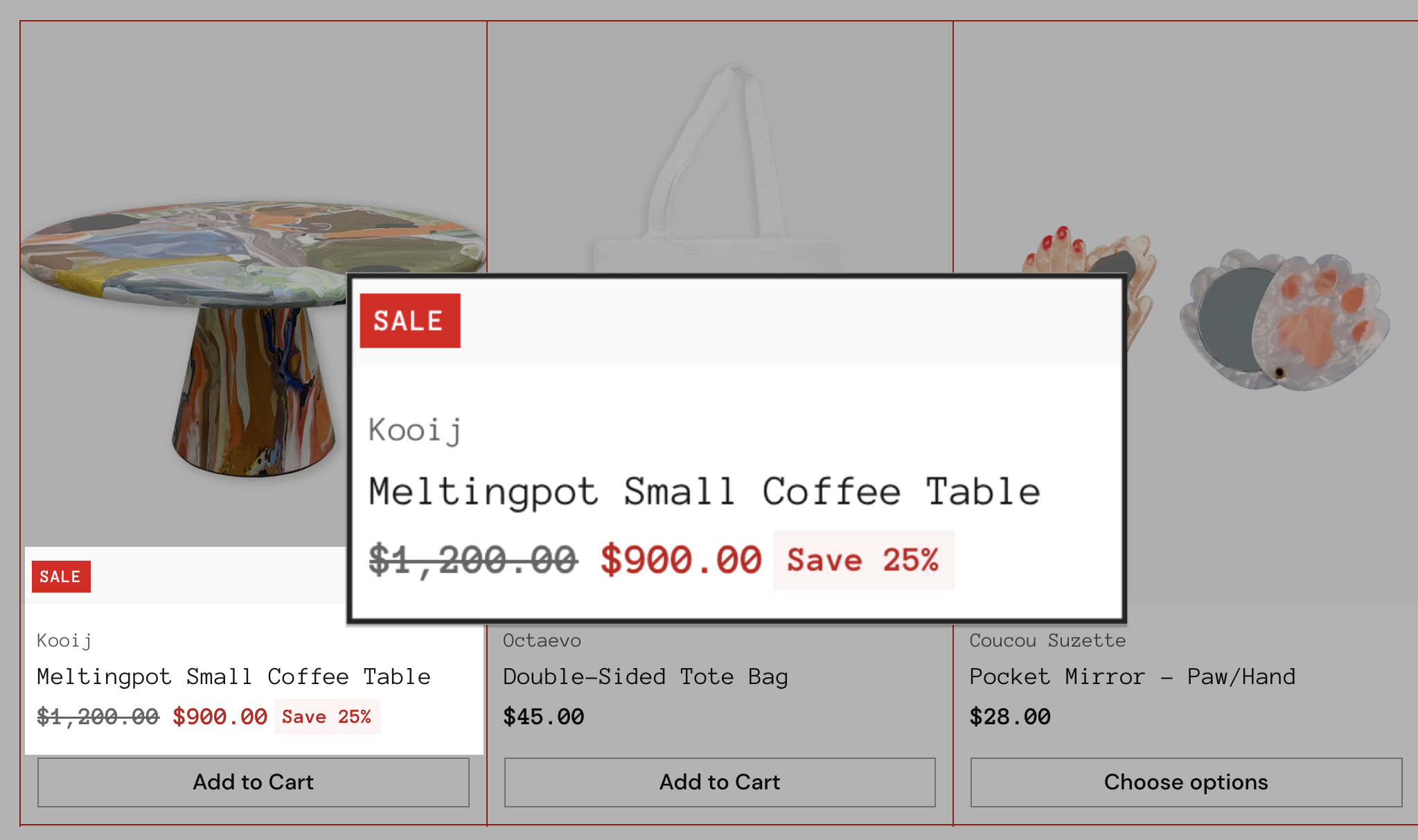
Card with discount amount.