Fluorescent
Cornerstone
Cornerstone
  • Cornerstone Help Center
    • Start using Cornerstone
      • Migrate your theme
      • Theme licenses
    • FAQs
    • Video tutorials
    • Changelog
  • General
    • Editing themes
      • Adding sections
      • Using templates
      • Accessibility
      • Customizing your site
      • H1 heading tags
      • SEO for Shopify themes
      • Online store speed
    • Image guide
      • Web ready photography
      • Image sizes
      • File formats
      • Theme image settings
    • Adapting theme content
      • Edit default theme content
      • Multiple languages
      • Dynamic content with metafields
      • Unique content for markets
    • Update your theme
  • Theme styles
    • Theme settings
    • Style presets
      • Demo layouts
    • Colors
    • Fonts
    • Animation
  • Pages
    • Templates
      • Home page
      • Blog page
      • Blog posts
      • Collections list page
      • Contact page
      • Customer accounts
      • Password page
      • Search page
      • 404 page
    • Sections
      • Section styles
      • Content blocks
      • Blog posts
      • Collapsible row list
      • Collection list
      • Collection list buttons
      • Contact form
      • Countdown banner
      • Countdown bar
      • Featured collection
      • Featured collection with media
      • Featured product
      • Grid
      • Icon with text columns
      • Image hero
      • Media with content split
      • Multi-column
      • Newsletter
      • Newsletter compact
      • Overlapping media with content
      • Promotion grid
      • Quick links
      • Rich text
      • Sales banner
      • Scrolling content
      • Slideshow
      • Tabbed collections
      • Testimonials
      • Video hero
    • Popups
      • Sign up popup
      • Age verification
      • Countdown signup popup
      • Promotional popup
  • Header
    • Announcement bar
      • Language selector
      • Country selector
      • Social media icons
      • Announcements
    • Header
      • Logo
      • Layout and style
      • Mega navigation
      • Transparent header
    • Mobile menu
    • Search bar
  • Footer
    • Footer
      • Contact and social block
      • Links block
      • Logo block
      • Newsletter and social block
      • Text and image block
      • Language and currency
      • Payment icons
      • Custom liquid
  • Products
    • Product listings
      • Layout and style
      • Product card details
    • Product badges
    • Quick shop
  • Product pages
    • Product template
    • Layout and style
      • Media gallery
      • Sticky product details
      • Recommended products sidebar
      • Breadcrumbs
      • Navigation buttons
      • Gift card recipient form
    • Overview blocks
      • Product header
      • Description
      • Variant selector
      • Buy buttons
      • Share icons
      • Collapsible rows block
      • Complementary products
      • Custom option
      • Customer support block
      • Image block
      • Image with text block
      • Information popup
      • Product labels
      • Payments and trust
      • Stock level indicator
      • Text block
      • Text columns with icons
      • Text list with icons
      • App blocks
    • Variant options
      • Chips
      • Swatches
        • Enable swatches
        • Use default colors
        • Use custom colors
        • Use custom images
        • Change swatch styles
        • Show on product cards
        • Dynamic option availability
      • Sibling product swatches
      • Media grouping
    • Product recommendations
  • Collection pages
    • Collection template
    • Banner
    • Product grid
    • Filters and sorting
  • Cart
    • Cart page
    • Quick cart
      • Added to cart popup
    • Free shipping bar
    • Low inventory warning
    • Cross sells
  • Support
    • Support policy
    • Shopify vs Theme issues
    • Store access requests
  • For developers
    • Custom CSS
    • Custom fonts
    • Custom Liquid
    • Custom JavaScript events
    • Edit Theme JavaScript
Powered by GitBook
On this page
  • Set up section
  • Section styles
  • Add slides
  • Add slide content
  • Show text box
  • Customize slideshow
  • Set image width and height
  • Autoplay slides
  • Slide navigation

Was this helpful?

  1. Pages
  2. Sections

Slideshow

Last updated 1 month ago

Was this helpful?

The Slideshow displays auto-rotating slides to showcase your product images. You can fine-tune how your images look, all slide headings and colors, and add a mobile-specific image for the best experience across all devices.

Editing templates will change all pages that use the same template. for different page layouts, or in the same template.

Set up section


In the editor side panel, click (+) Add section and select Slideshow. Click and hold the drag handles ⋮⋮ to re-order sections.

Section styles

Sections include general styles. Click the section to find options for spacing, and animations.

Add slides


Click (+) Add block to add a slide block. Use the drag-and-drop handles ⋮⋮ to change the order of the slides. Click the Slide blocks to add an image.

Click Image slide block to find settings

Setting
Description

Image

Select or upload an image to display as the background of the banner.

Mobile image

Select or upload an alternate image to display on mobile devices.

Image link

Select a page or URL to make the entire image a clickable link.

Image focal point

For desktop and mobile, select the most important part of your image to keep centered. Use focal points to avoid unwanted cropping across different screen sizes.

Add slide content


After adding an image, add headings, text, and buttons. You can adjust the text size and change the alignment of the slide content.

Click Slide block to find settings

Setting
Description
Options

Custom width

Use the sliders to set the maximum width (in pixels) of the section content.

400 - 1000 px

Text position

Set the position of the text content for desktop screens.

Top / Middle / Bottom Left / Center / Right

Mobile text position

Set the position of the text content for mobile screens.

Top / Middle / Bottom Left / Center / Right

Accent

The small text above the heading.

Accent divider

Choose to show a border beneath the Accent heading.

Accent divider color

Choose to use the Theme color (as selected in the theme settings) or the Current color (as selected in the section settings).

Heading

The title of the slide.

Heading size

Change the size of the heading text from small to large.

1 - 8

Text

Add multiple lines of rich text. Use the buttons to make the text bold or italicized, or to add a link.

Text size

Adjust the size of the section text from small to large.

1 - 8

Button link

The URL that you want the button to link to.

Button label

The text that displays on the button.

Button style

Change the style of the button.

Solid Outline Text

Show text box


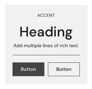
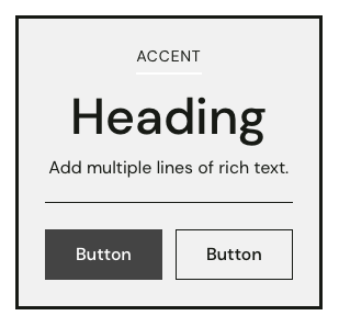
Choose to display the slide content inside a text box. You can show tiles with shadows or borders.

Click Slideshow section to find settings

Setting
Description

Show text box

Choose to show a border around the slide content.

Text box style

Display text boxes with a Soft drop shadow, Solid drop shadow, or Borders with different thicknesses.

Color scheme

Select the Default color scheme from your theme settings or select a variant scheme based on the default colors: either Inverse, Soft, Accent, or Sale. You may also select one of the two custom color schemas.

Override with custom colors

Check this option to apply custom colors to the section. These colors will override the color scheme.

Text color

Select a custom color for all text.

Background color

Select a custom color for background of text box.

Customize slideshow


Click the Slideshow section to customize the overall appearance of the section.

Set image width and height


Under Image height, choose to display the image with a Fixed or Relative height.

  • Fixed heights maintain the same pixel height on all screens.

  • Relative heights adapt the image height as a percentage of the screen height.

Click Slideshow section to find settings

Setting
Description
Options

Enable full width

Choose to span the slide across the whole window or screen, removing the margins on either side.

Desktop height

Set the section height to a fixed height (in pixels) or relative height (as a percentage of the screen height).

Fixed height 250 - 750px Relative height 50 - 100%

Mobile height

Choose a fixed height (in pixels) or relative height (as a percentage of the screen height).

Fixed height 150 - 750px Relative height 50 - 100%

Autoplay slides


By default, multiple slides will auto-rotate every 6 seconds. You can change the time between slides or disable autoplay to let visitors rotate through slides with the pagination buttons.

Click Slideshow section to find settings

Setting
Description
Options

Enable autoplay

When checked, slides will auto-rotate.

Time between slides

Set the number of seconds to show each slide before auto-rotating.

4 - 20 secs

Slide navigation


Change the alignment and colors of the navigation buttons used for moving forward or backward through slides.

Click Slideshow section to find settings

Setting
Description

Navigation alignment

Choose to align the navigation buttons either to the Left, Center, or Right within the slides.

Show drop shadows

Display colored shadows around the navigation elements.

Foreground

Change the color of the autoplay bar and play/pause button.

Background

Change the color of the box behind the navigation buttons.

Background opacity

Use the slider to adjust the transparency of the background. Set the opacity to 0% to hide the background. If set to 100%, the background will be opaque.

Background effect

Choose to use a color Fill or a Radial gradient for the background.


Related links

Learn more about .

Section spacing

Section animations

Grid
Image hero
Image with content
show dynamic page content
Create new templates
Cover

Using color overlays

Learn how to change overlay colors and use gradients.

Soft shadow
Solid shadow
Thick border
Color schemes