Create nested menu in admin
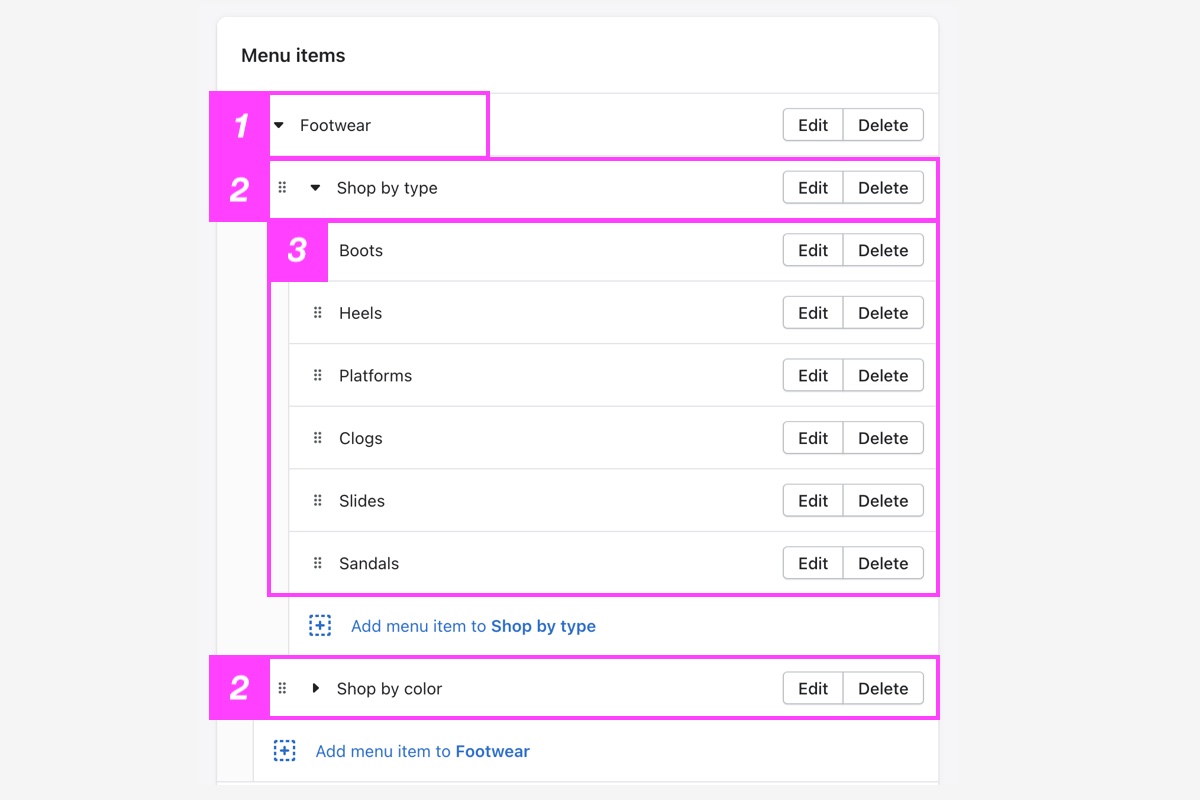
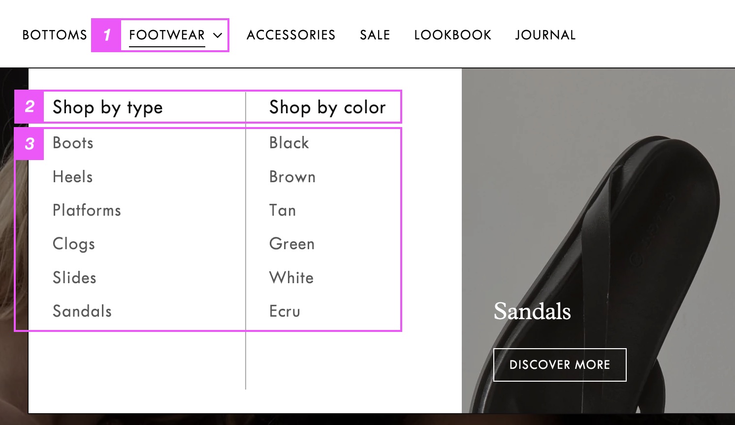
*** Before adding the mega menu block, you will need to create a menu with three levels of nested links. * The **top-level** link appears in the header and opens the mega menu. * The **2nd-level** links appear as column headings inside the mega menu. * The **3rd-level** links appear in columns below the second-level links. From your Shopify admin, go to **Content > Menus**. Choose a menu item to be the 'parent' or top-level link that will open the mega menu from the header. To create 2nd-level and 3rd-level links, use the drag-and-drop handles **`⋮⋮`** to move links under other links to nest them.STEPS
In your **Shopify admin**: 1. Go to **Content > Menus**. 2. Select the main menu used for your header. 3. Add a top-level link that will open the mega menu and contain the nested sub-menus. 4. Add your 2nd-level menu links and use the drag handles ⋮⋮ to move them under the top-level link. 5. Add your 3rd-level menu links and use the drag handles ⋮⋮ to move them under the 2nd-level links. 6. Click **Save.**

Add mega menu block
*** Once you have created your nested menu, you can now add **mega menu blocks** to your **Header** in the theme editor. > 1. Click the arrow next to the **Header** section, and click **(+) Add Mega menu**. Choose either the **Compact mega menu** or **Full width mega menu**. > 2. Click the **Mega menu block** to open the settings. > 3. Enter the exact name of the top-level link (e.g. "Shop") in the **Dropdown parent link** field. > 4. Click **Save**. {% hint style="warning" %} If you've translated your store using an app, make sure the "Parent dropdown link" name is not translated, as this will break the mega menu. See instructions below for [fixing translated mega menus](#fix-translated-mega-menus). {% endhint %}  ### Customize menu layout Change the number of columns, change the total column width, and choose to show dividers. Click Mega menu block to find settings| Setting | Description | Options |
|---|---|---|
| Column count | Set the number of columns. If there are more submenus than columns, then submenus will appear in multiple rows. | 1-4 Default: 4 |
| Total column width | (For compact mega menu) Use the slider to expand the total width of the mega nav and the space between the menu lists and image. | |
| Show column dividers | Display dividing lines between the menu columns. |
STEPS
In your theme editor (**Customize**): 1. Make sure **Show promo** is enabled. 2. Select or upload a **Image** to display inside the mega navigation menu. This image is not displayed on mobile. 3. Use the **Promo width** and **Height** sliders to change the shape and size of your promo image. 4. Set the **Promo position** to the **Left** or **Right** side of the mega nav. 5. Use **Image focal points** to specify the main focus of your images. The focal point of your image will remain centered and within frame when your site adapts to different screen sizes. > See our [image guide](https://help.fluorescent.co/stiletto/general/image-guide/theme-image-settings#image-focal-point) to learn more about specifying a focal point for an image used within a section or for an uploaded image file when used anywhere on your site. 6. (*Optional*.) Add **Promo text** as a title on your image. 7. Select or paste a URL for the **Button link**. 8. Enter text for the **Button label**. > The most effective button labels ask customers to do something (e.g. Get started, Join us, Shop now). To learn more, [read "What is a Call to Action?"](https://www.thebalancesmb.com/call-to-action-1794380) 9. Select a **Text position** (above) to position your headings (and button) in one of 9 areas of the grid block. 10. Use the color selectors to customize the **Text** color. > We recommend using WebAIM's [contrast checker](https://webaim.org/resources/contrastchecker/) when matching colors to make sure your text is clear and readable for everyone. 11. Change the **Overlay color** and **Overlay opacity** using the slider to increase the contrast between the text and slide image. > These settings help make your text clear and readable. > Set the **Opacity** to **`100%`** to create a solid color slide. This helps avoid images that include text in the image itself, which are not responsive or recommended. 12. (*Optional*) Click the **Overlay gradient** option to add a color overlay that fades across a range of hues. > You can choose the style, angle, position, and opacity of the gradient. See Shopify's [color gradient guide](https://help.shopify.com/en/manual/online-store/themes/theme-structure/color-scheme#gradients) to learn more. 13. Click **Save**.Fix translated mega menus
*** When translating your theme, make sure the "Dropdown parent link" text from the mega menu settings is **not** translated. If you've auto-translated your theme, the parent link text may have been translated, which will break the mega menu for other languages. If you're using the [Translate & Adapt app](https://apps.shopify.com/translate-and-adapt): > 1. In the Shopify admin, click **Translate & Adapt** to open the app. > 2. Go to **Theme > Section groups**. > 3. Click **Header Group** in the side panel. > 4. Scroll down to find the "Meganav Parent link" that's used for the dropdown parent link. > 5. Delete any translations of the parent link in the secondary language column. > 6. Click **Save**.