Fluorescent
Stiletto
Stiletto
  • Stiletto Help Center
    • Start using Stiletto
      • Theme licenses
      • Migrate your theme
    • FAQs
    • Video tutorials
    • Changelog
  • General
    • Editing themes
      • Adding sections
      • Using templates
      • Accessibility
      • Customizing your site
      • SEO for Shopify themes
      • H1 heading tags
      • Online store speed
    • Image guide
      • Web ready photography
      • Image sizes
      • File formats
      • Theme image settings
    • Adapting theme content
      • Edit default theme content
      • Multiple languages
      • Dynamic content with metafields
      • Unique content for markets
    • Update your theme
  • Theme styles
    • Theme settings
    • Style presets
      • Demo layouts
    • Fonts
    • Colors
    • Animation
  • Pages
    • Templates
      • About page
      • Blog page
      • Blog posts
      • Collections list
      • Contact page
      • Customer accounts
      • FAQ page
      • Lookbook
      • Password page
      • Search page
      • Store locations
      • 404 page
      • Home page
    • Announcement bar
    • Header
      • Layout and style
      • Logo
      • Transparent header
      • Mega menus
      • Mobile menu
      • Quick search
      • Language and currency
      • Social media icons
      • Customer account icon
    • Footer
      • Links block
      • Newsletter block
      • Text and image block
      • Language and currency
      • Payment icons
      • Custom Liquid
  • Sections
    • Theme sections
      • Using sections
      • Content blocks
      • Blog posts
      • Collapsible row list
      • Collection list grid
      • Collection list slider
      • Complete the look
      • Contact form
      • Countdown banner
      • Countdown bar
      • Events
      • Featured collection grid
      • Featured collection slider
      • Featured product
      • Gallery carousel
      • Grid
      • Image compare
      • Image hero
      • Image hero split
      • Image with text
      • Image with text split
      • Multi column
      • Newsletter
      • Newsletter compact
      • Promotion banner
      • Promotion bar
      • Quotes
      • Recently viewed products
      • Rich text
      • Sales banner
      • Scrolling content
      • Shoppable image
      • Shoppable image editorial
      • Slideshow
      • Testimonials
      • Video
      • Video hero
      • Video with text
    • Popups
      • Sign up popup
      • Age verification
      • Countdown popup
      • Promotional popup
  • Products
    • Product listings
      • Product card style
    • Prices and discounts
    • Product badges
    • Quick shop
  • Product pages
    • Product template
      • Alternate templates
      • Pre-order template
      • Gift card
    • Layout and style
      • Product tabs
      • Media gallery
      • Sticky product details
      • Breadcrumbs
      • Navigation buttons
    • Overview blocks
      • Default blocks
        • Description
        • Product header
        • Variant selector
        • Quantity selector
        • Buy buttons
        • Local pickup banner
        • Share icons
        • Sticky add-to-cart bar
      • Collapsible rows block
      • Complementary products
      • Custom options
      • Image block
      • Information popup
      • Product labels
      • Secure payment
      • Stock level indicator
      • Text block
      • Text list with icons
      • App blocks
    • Variant options
      • Variant chips
      • Variant swatches
        • Enable swatches
        • Use default colors
        • Use custom colors
        • Use variant images
        • Use custom images
        • Change swatch styles
        • Show on product cards
        • Dynamic option availability
      • Media grouping
      • Sibling product swatches
    • Product page sections
      • Product reviews
      • Product recommendations
  • Collection pages
    • Collection template
      • Collection landing
      • Sale collection
      • Subcollections
      • Flash sale
    • Banner
    • Product grid
    • Filters and sorting
  • Cart
    • Cart page
    • Quick cart
      • Added to cart popup
      • Empty cart promotion
    • Free shipping bar
    • Low inventory warning
    • Cross sells
  • Support
    • Support policy
    • Shopify vs Theme issues
    • Store access requests
  • For developers
    • Custom CSS
    • Custom fonts
    • Custom Liquid
    • Custom JavaScript events
    • Edit Theme JavaScript
Powered by GitBook
On this page
  • Choose layout style
  • Mobile carousel
  • Image aspect ratio
  • Media options

Was this helpful?

  1. Product pages
  2. Layout and style

Media gallery

Last updated 3 months ago

Was this helpful?

The Media gallery displays product images and videos for Product pages and Featured products.

Change the layout and style of the gallery media, and change the size and shape of images and videos.

To show images only for the selected variant, you can set up .

Choose layout style


Display product media as a grid, list, or show additional images as thumbnails. Adjust the Gallery size and choose to show a More media button for large galleries.

Click Product overview or Featured product section to find settings

Setting
Description

Gallery style

Grid displays media in two columns. List displays media in one column. Thumbnails displays all media as small clickable images next to the main product image.

Gallery style mobile

Change how the media gallery is displayed on mobile. Carousel displays a rotating row that can be swiped through. Grid displays media in two columns. List displays media in one column.

Thumbnails displays all images below the main image

Gallery size

Change the size of the thumbnail product images. Either Small, Medium, Large, Extra Large.

Hide gallery media after

Choose to show a More media button after a certain number of rows. Select either 1 row, 2 rows, 3 rows, or Never.

Mobile carousel

The following settings apply when Gallery style mobile is set to Carousel.

Setting
Description

Enable looping

Restart the carousel when visitors swipe through the last image.

Show image full width

Make the current image span the full width of the screen. When disabled, the edges of the previous and next images will appear.

Hide pagination dots

Choose whether to show dots that allow visitors to select a product image to view. This option does not apply when Show images full width is selected.

Image aspect ratio


Make your product media a uniform shape or use their original proportions.

Click Product overview or Featured product section to find settings

Setting
Description
Options

Aspect ratio

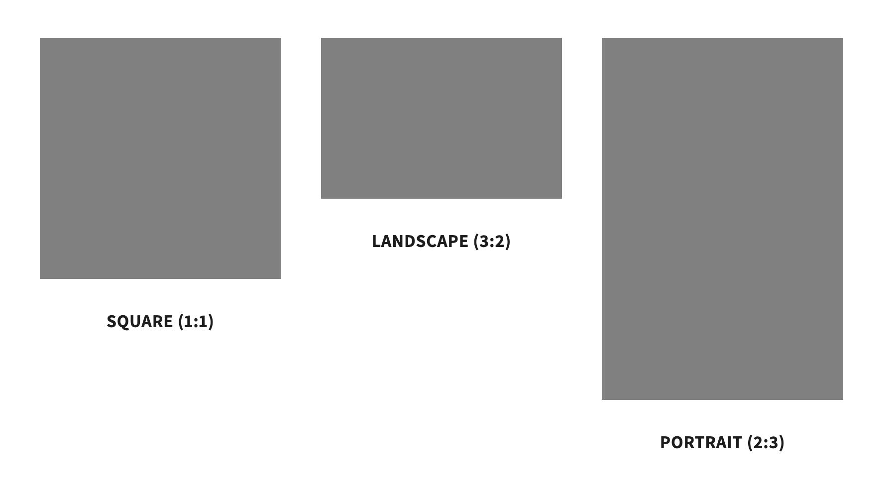
Select an aspect ratio to crop images to be a uniform shape, or select Natural to display images in their original shape.

Natural Default Portrait (2:3) Square (1:1) Landscape (3:2)

Media options


Adjust options for displaying featured media, video looping, and image zoom.

Click Product overview or Featured product section to find settings

Setting
Description

Show featured media first

Choose to display the main image set in the product's admin settings when the page first loads. By default, the image of the first in-stock variant will be displayed. Only applies to thumbnails and carousel styles.

Enable video looping

After a video starts playing, choose to loop the video continuously.

Enable image zoom

Allow visitors to view product images in a larger view.

Display specific sets of images for selected variants.


Related links

Breadcrumbs
Navigation buttons
Sticky product details
Media grouping
media grouping