Product listings
Last updated
Last updated
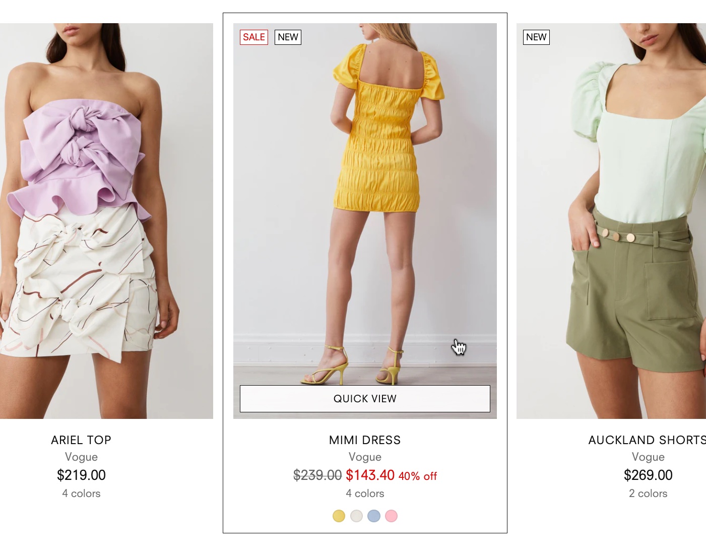
Product listings are grids or rows of products displayed on collection pages and theme sections. Each product card displays the product's image, title, and price.
Go to Theme settings > Product listings to customize the appearance of product cards and choose to show additional elements, like the Quick view button for adding products directly to the cart and Product badges.
You can choose to show swatches, chips, vendors, and a border when customers hover over the products.
Setting | Description |
---|---|
Show vendor | Display vendor name beneath the product information. |
Show swatches | Show product swatches on hover. You will need to set up Swatches. |
Swatch size | Change the size of swatches on products cards. Select Small, Medium, or Large. |
Show chips. | Show product chips (variant boxes) on hover. To change which product options should use chips, add or remove the option names in Variant option for chips. |
Show border on hover | Show a border line around the product cards when hovered over. |
Product rating | This setting is for Shopify's Product reviews app, which has been discontinued. Learn about Shopify's Product reviews. |
Show discount | Display the discount price on the product card. |
Choose to Enable the quick view button that opens a popup with product details and form to let customers learn more and buy products on the same page.
See the Quick view template guide to edit the appearance of the quick view popover.
Change the shape (aspect ratio) and fit of product images, and enable a secondary image on hover.
Setting | Description |
---|---|
Show second image on hover | Display the second product image when hovered over. |
Image aspect ratio | Choose to crop all product images to be a single uniform shape. Select Portrait (2:3), Square (1:1), or Landscape (3:2). Select Natural to display images in their original shape (without cropping). Learn more about aspect ratios in our Image settings guide. |
Media fit | Make product images Cover the full product card or Fit within the card with its original shape. |
Choose whether to show sale, sold out, and custom badges on the products.
To set up custom product badges, including colors and labels, see the Product badges guide.
Setting | Description |
---|---|
Show "Sale" badge | Display badges for products on sale. |
Show "Sold-out" badge | Display badges for products with no stock. |
Show custom badges | Display custom badges created in the Product badges theme settings. |
Position | Display all badges either in the Top left or Top right of product cards. |
|
For products that are sold out or have a $0 price, you can choose to hide the price or show custom text instead.
Go to Theme settings and open the Product listing tab. Scroll down to Prices to find the following settings.
To change price display options on product pages, go to Theme settings > Product.
Setting | Description |
---|---|
$0 prices | Choose to Show, Hide, or replace all $0 prices with a Custom label. This setting does not apply to products with compare-at prices. |
Sold-out prices | Choose to Show, Hide, or replace all prices of sold out products with a Custom label. If a product is both $0 and sold out, sold out settings will apply. |
By default, $0 prices use "Free" and sold-out prices use "Sold out" as custom labels. You can change these labels in your default theme content editor.
You can only access the default theme content editor for purchased themes on Shopify.
Related links