Fluorescent
Cornerstone
Cornerstone
  • Cornerstone Help Center
    • Start using Cornerstone
      • Migrate your theme
      • Theme licenses
    • FAQs
    • Video tutorials
    • Changelog
  • General
    • Editing themes
      • Adding sections
      • Using templates
      • Accessibility
      • Customizing your site
      • H1 heading tags
      • SEO for Shopify themes
      • Online store speed
    • Image guide
      • Web ready photography
      • Image sizes
      • File formats
      • Theme image settings
    • Adapting theme content
      • Edit default theme content
      • Multiple languages
      • Dynamic content with metafields
      • Unique content for markets
    • Update your theme
  • Theme styles
    • Theme settings
    • Style presets
      • Demo layouts
    • Colors
    • Fonts
    • Animation
  • Pages
    • Templates
      • Home page
      • Blog page
      • Blog posts
      • Collections list page
      • Contact page
      • Customer accounts
      • Password page
      • Search page
      • 404 page
    • Sections
      • Section styles
      • Content blocks
      • Blog posts
      • Collapsible row list
      • Collection list
      • Collection list buttons
      • Contact form
      • Countdown banner
      • Countdown bar
      • Featured collection
      • Featured collection with media
      • Featured product
      • Grid
      • Icon with text columns
      • Image hero
      • Media with content split
      • Multi-column
      • Newsletter
      • Newsletter compact
      • Overlapping media with content
      • Promotion grid
      • Quick links
      • Rich text
      • Sales banner
      • Scrolling content
      • Slideshow
      • Tabbed collections
      • Testimonials
      • Video hero
    • Popups
      • Sign up popup
      • Age verification
      • Countdown signup popup
      • Promotional popup
  • Header
    • Announcement bar
      • Language selector
      • Country selector
      • Social media icons
      • Announcements
    • Header
      • Logo
      • Layout and style
      • Mega navigation
      • Transparent header
    • Mobile menu
    • Search bar
  • Footer
    • Footer
      • Contact and social block
      • Links block
      • Logo block
      • Newsletter and social block
      • Text and image block
      • Language and currency
      • Payment icons
      • Custom liquid
  • Products
    • Product listings
      • Layout and style
      • Product card details
    • Product badges
    • Quick shop
  • Product pages
    • Product template
    • Layout and style
      • Media gallery
      • Sticky product details
      • Recommended products sidebar
      • Breadcrumbs
      • Navigation buttons
      • Gift card recipient form
    • Overview blocks
      • Product header
      • Description
      • Variant selector
      • Buy buttons
      • Share icons
      • Collapsible rows block
      • Complementary products
      • Custom option
      • Customer support block
      • Image block
      • Image with text block
      • Information popup
      • Product labels
      • Payments and trust
      • Stock level indicator
      • Text block
      • Text columns with icons
      • Text list with icons
      • App blocks
    • Variant options
      • Chips
      • Swatches
        • Enable swatches
        • Use default colors
        • Use custom colors
        • Use custom images
        • Change swatch styles
        • Show on product cards
        • Dynamic option availability
      • Sibling product swatches
      • Media grouping
    • Product recommendations
  • Collection pages
    • Collection template
    • Banner
    • Product grid
    • Filters and sorting
  • Cart
    • Cart page
    • Quick cart
      • Added to cart popup
    • Free shipping bar
    • Low inventory warning
    • Cross sells
  • Support
    • Support policy
    • Shopify vs Theme issues
    • Store access requests
  • For developers
    • Custom CSS
    • Custom fonts
    • Custom Liquid
    • Custom JavaScript events
    • Edit Theme JavaScript
Powered by GitBook
On this page
  • Section colors
  • Use color scheme
  • Use custom section colors
  • Image overlays
  • Section padding
  • Section animations
  • Turn off animations

Was this helpful?

  1. Pages
  2. Sections

Section styles

Last updated 1 month ago

Was this helpful?

Sections include general style options. In the editor side panel, click the section to find settings for Section colors, image overlays, padding, and animations.

Section colors


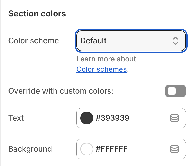
You can change a section's color scheme or use custom colors for your section. Click a section to open the settings and find the Section colors area.

Use color scheme


Variant color schemes generate alternate colors based on your default theme colors. There are four variant color schemes: Inverse, Soft, Accent, or Sale.

Click the section to find color settings

Default

Inverse

Swap default Text and Background colors.

Soft

Use a blend of default Text and Background colors.

Accent

Use default Accent and Accent contrasting colors.

Sale

Use default Sale color for background and default Background color for text.

Custom

Use custom section colors


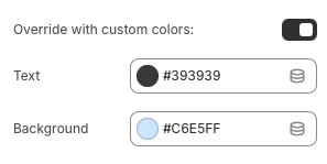
Instead of using a color scheme, you can use custom colors for the text and background. In the section settings, enable the Override with custom colors option.

Click section to find settings

Setting
Description

Override with custom colors

Enable to apply custom colors to the section. These colors will override the color scheme.

Text color

Select a custom color for headings, text, and foreground elements.

Background color

Select a custom color for the section background.

Image overlays


When text appears on top of images, sections use Image overlay colors for the text. You can use the default colors from your theme settings, or select custom colors for the section.

The overlay also applies a tint over top the image. You can use a solid or gradient color, or turn it off.

1

Change overlay colors

  • To change the default overlay colors for all sections, go to Theme settings > Colors > Image overlay.

  • To use custom overlay colors, open the section settings to enable Override with custom colors. Select the Text and Tint colors.

2

Use solid or gradient style

Change the Tint style to use a solid or gradient color overlay. Gradient overlays fade from solid to transparent. You can select the direction of the fade.

3

Change transparency

Use the Tint opacity slider to make the tint more or less transparent. Set the opacity to 0% to turn off the tint overlay.

Click block or section to find settings

Setting
Description

Tint opacity

Use the slider to change the transparency of the overlay. Set the opacity to 0% to turn off the tint overlay.

Tint style

Select a Solid color or Gradient color overlay for the tint. For gradients, select a direction of the fading color.

Override with custom colors

Check this option to use custom overlay colors, instead of the default theme colors .

Text color

Select a custom color for the headings and text.

Tint color

Select a custom overlay color.

Section padding


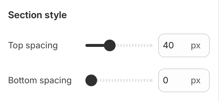
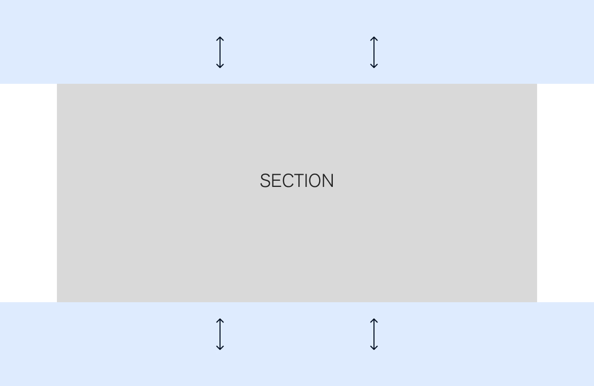
Add or remove space at the top and bottom of the section. Click the section to open the settings. Under Section style, use the Top spacing and Botton spacing sliders. Set to 0px to remove spacing.

Section animations


When animations are enabled, text and images are loaded dynamically: section contents slide, fade, zoom, or ease into position at a delay rather than all at once.

Other animations include a "shimmer" over images and subtle visual changes to elements like buttons or hot spots.

Turn off animations


You may want to turn off animations if you have concerns about load time, style, or accessibility.

  • To turn off animations for a section, click the section to open the settings. Under Section style, toggle off Enable animations.

  • To turn off animations for all sections, go to Theme settings > Animation and toggle of Enable section animations.

Sections use the colors from your theme settings as the default color scheme. You can select a variant color scheme or .

Use colors selected in .

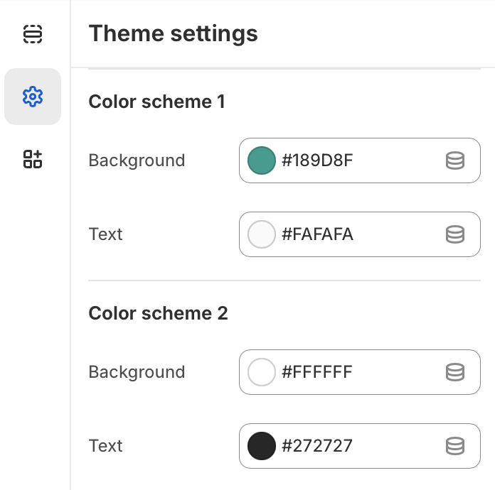
Apply Color scheme 1 or Color scheme 2 from your theme settings. Go to Theme settings > Colors > Color scheme to edit.
Overlay colors with high contrast help keep text readable and .

Set the opacity to 100% to create solid color blocks or banners in sections like , , or .

Grid
Image hero
Slideshow
use custom section colors
Theme settings > Color > General
accessible for everyone
Solid color with 70% opacity
Gradient color - bottom to top