
| Section spacing | #section-padding |
| Section animations | #section-animations |
| Using color overlays | Learn how to change overlay colors and use gradients. | #image-overlays | overlay-solid.png |
| Setting | Description |
|---|---|
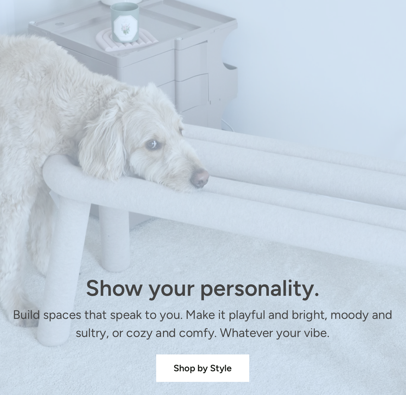
| Image | Select or upload an image to display as the hero image. There are no required images dimensions. We simply recommend uploaded images have a minimum width of 2500px for optimal quality across all devices. |
| Mobile image | Select or upload an alternate image to display on mobile devices. You may want a different image that works best with mobile screen dimensions, for example a portrait shaped image. |
| Image link | Select a page or URL to make the entire image a clickable link. |
| Image focal point | For desktop and mobile, select the most important part of your image to keep centered. Use focal points to avoid unwanted cropping across different screen sizes. |
| Setting | Description | Options |
|---|---|---|
| Enable full width | Choose to span the image across the whole window or screen, removing the margins on either side. | |
| Desktop height | Set the section height to a fixed height (in pixels) or relative height (as a percentage of the screen height). | Fixed height 250 - 750px Relative height 50 - 100% Default: 650px |
| Mobile height | Choose a fixed height (in pixels) or relative height (as a percentage of the screen height). | Fixed height 150 - 750px Relative height 50 - 100% Default: 450px |


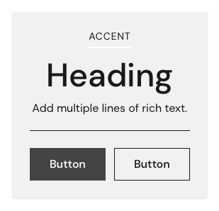
| Accent | Add small label heading. | #accent |
| Heading | Add title heading. | #heading |
| Text | Add multiple lines of rich text. | #text |
| Button | Add buttons with custom styles. | #button |
| Image | Add images with custom sizes. | #image |
| Text list with icons | Add column text with icons. | #text-list-with-icons |
| Video player | Add video that plays in a popup viewer. | #video-player |
| Divider | Add border between blocks. | #divider |
| Spacer | Add space between blocks. | #spacer |
| Setting | Description |
|---|---|
| Content width | Set the maximum width of the section: between 400 and 1000 px. |
| Text position | Change the position of the content blocks within the section for desktop screens. |
| Mobile text position | Change the position of the content blocks within the section for mobile screens. |
Soft shadow

Solid shadow
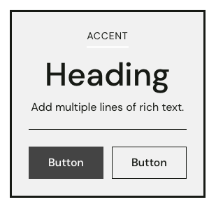
Thick border
| Setting | Description |
|---|---|
| Show text box | Display all content blocks within a container. |
| Text box style | Display boxes with a Soft drop shadow, Solid drop shadow, or Borders with different thicknesses. |
| Color scheme | Change the color scheme applied to the text box. Use the Default color scheme from your theme settings or select a variant scheme based on the default: either Inverse, Soft, Accent, or Sale. You can also select a custom color scheme. Learn more. |
| Override with custom colors | Use custom colors for this section to override the color scheme. |
| Text color | Select a custom color for text within the text box. |
| Background color | Select a custom color for the background of text box. |